6 Free Fonts That Look Like GTA 6 (Neon, Retro and Vice City Style)
GTA 6 is finally out, and my feed has turned purple, pink and orange overnight. Every second poster, thumbnail and story now wants that Vice City look: sunset skies, palm trees, neon signs and big, loud lettering.
Nitin Monga
Designer · Developer · 3D Artist
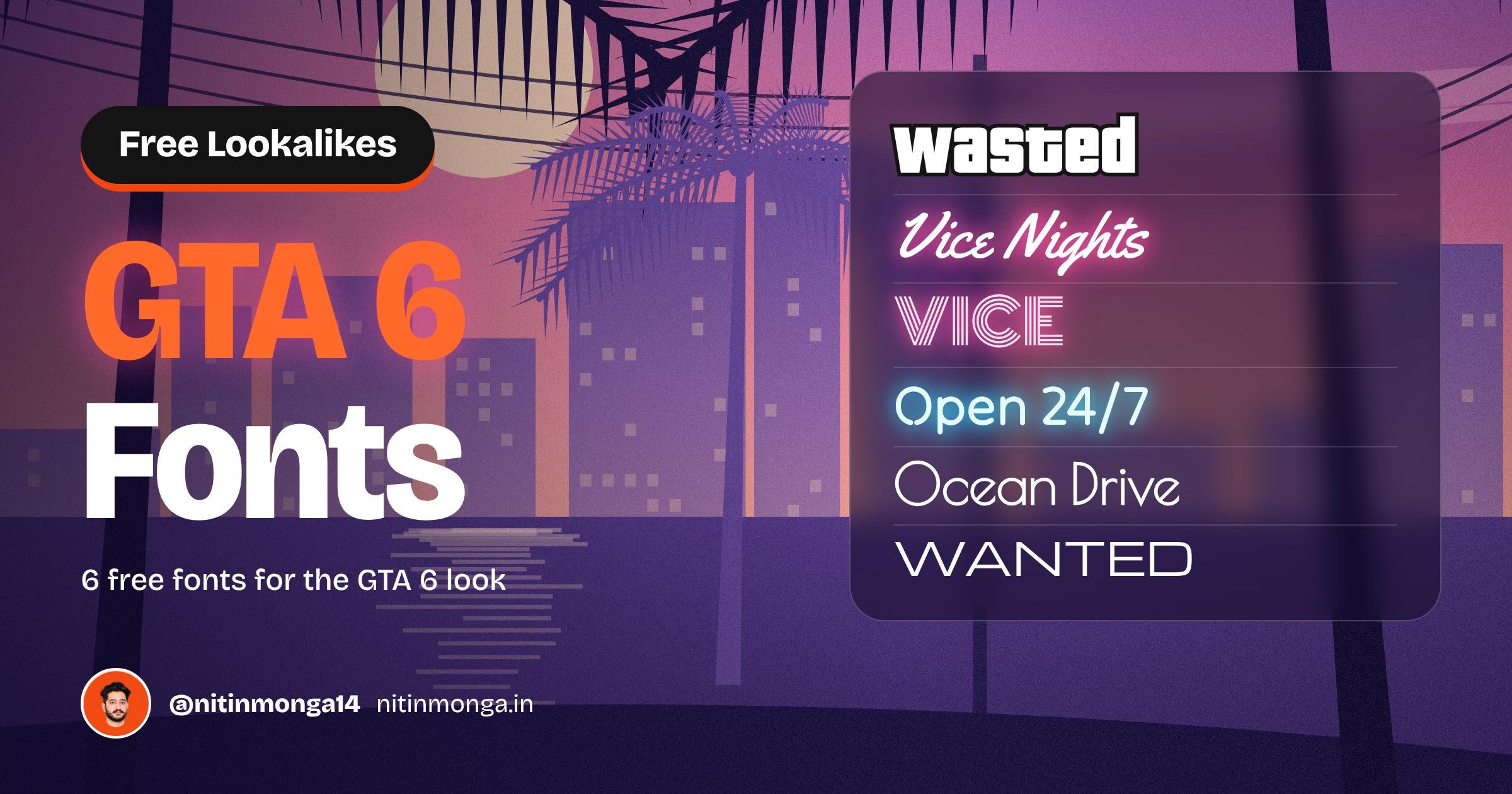
The colours are easy to copy. The type is where most designs fall apart. You can have the perfect sunset gradient behind you, but if the headline is set in Arial, it still looks like a school project.
So I went through the GTA 6 artwork, the logo, the signage in the trailers and the game screens, and matched each look with a font you can download for free. Five of them come from Google Fonts. One of them is the actual font behind the classic Grand Theft Auto wordmark.
If you came here after commenting GTA on my post, welcome. Here is the full list with what each font is best for, a tip from my own work, and the download link.
What makes type look like GTA 6
Before the list, it helps to know what you are actually trying to copy. When you look closely, the GTA 6 world uses four very different kinds of lettering.
The heavy title. The Grand Theft Auto wordmark has been chunky, rounded and loud since the early games. It is the most recognisable part of the brand.
The neon script. Soundtrack covers, club signs and posters in the game use flowing, glowing script that looks like it was bent out of a glass tube.
The signage. Motels, diners and hotels along the beach use neon tubes and thin art deco letters, the kind you still see on Ocean Drive in Miami.
The interface. The game screens, menus and mission text are clean, wide and easy to read at a glance.
The trick is to pick one of these for your headline and keep everything else quiet. Six neon fonts on one poster will not look like GTA. It will look like a fairground.
1. Pricedown: the classic GTA title
Pricedown by Ray Larabie of Typodermic is the font behind the Grand Theft Auto wordmark that the series has used for years. It is a heavy, retro display face with squared loops and rounded corners. Typodermic says it is a modern take on Pinto Flare, a display typeface from the early 1970s, and it was also used for the logo of the game show The Price is Right, which is where the name comes from.
Best for: game titles, YouTube thumbnails, event posters, gaming channel branding, streetwear prints.
GTA 6 vibe: the classic GTA logo look, and the WASTED and MISSION PASSED feel.
My tip: add a thick black outline around the letters and a slight drop shadow. That outline is what makes Pricedown feel like a game screen instead of a sale banner.
License note: Pricedown Black is free under the Typodermic Desktop License. You can use it in commercial graphics such as posters, logos, thumbnails and videos. It does not cover embedding the font in a website or an app, so check the license if you need that.
Download Pricedown from Typodermic
2. Yellowtail: the sunset soundtrack script
Yellowtail is a bold, flowing script with a strong 1970s and 1980s feel. It looks like the lettering on a vintage surf shop or a cassette cover from a beach radio station. Set it in white with a pink glow on a sunset background and you get very close to the neon script style used on GTA style soundtrack art.
Best for: album and playlist covers, retro posters, cafe and juice bar logos, summer campaigns.
GTA 6 vibe: glowing neon script, the soundtrack cover look.
My tip: never set it in all caps. Script capitals joined together are hard to read. Use it for one or two words in title case, and pair it with a thin, widely spaced sans serif above it, the way retro album covers do.
Download Yellowtail on Google Fonts
3. Monoton: 80s Vice City neon
Monoton is drawn with several parallel lines inside every letter, like a neon sign made of many thin tubes. It is pure 1980s. Use it in capitals and it instantly says nightclub, arcade and Vice City.
Best for: neon sign mockups, club flyers, retro event titles, music covers.
GTA 6 vibe: the multi line neon you see on 80s Miami buildings.
My tip: Monoton needs size. Keep it for short words of four to eight letters and set it large. At small sizes the inner lines blur together and it turns into a grey smudge, especially on a phone.
Download Monoton on Google Fonts
4. Tilt Neon: roadside motel signs
Tilt Neon is a rounded sans serif that looks like bent glass tubing. It is part of the Tilt family on Google Fonts, and its variable axes let you rotate the letters slightly in 3D, as if the sign is hanging at an angle above a motel door.
Best for: night signage, bar and restaurant menus, open and closed signs, posters with a nightlife mood.
GTA 6 vibe: glowing roadside motel and diner signs.
My tip: the glow does half the work. In Photoshop, add an Outer Glow in a pink or cyan close to the text colour, then duplicate the layer and blur it again for a softer second glow. Put it on a dark wall texture and it reads as a real sign.
Download Tilt Neon on Google Fonts
5. Poiret One: Ocean Drive art deco
Poiret One is a thin, elegant art deco display font with geometric shapes and very light strokes. It reminds me of the names painted on pastel hotels along Miami Beach, which is exactly the world that GTA 6 is built on.
Best for: hotel and resort branding, luxury invitations, beach bars, fashion and lifestyle posters.
GTA 6 vibe: the art deco beachfront at golden hour.
My tip: Poiret One is very thin, so give it contrast. White or cream on a deep teal, coral or violet background works beautifully. On a busy photo, add a soft colour overlay first or the letters will disappear.
Download Poiret One on Google Fonts
6. Michroma: wide HUD style titles
Michroma is a wide, geometric sans serif with a technical, slightly futuristic feel. It is the closest free match for the clean, wide lettering you see on game menus, loading screens and car brands.
Best for: game UI mockups, esports graphics, tech product titles, car and bike branding.
GTA 6 vibe: wide, clean interface titles like WANTED or MISSION.
My tip: open up the letter spacing a little and keep it in capitals. Wide fonts look premium when they have air around them. Pair it with a simple sans serif like Inter for smaller text.
Download Michroma on Google Fonts
How to make a GTA 6 style poster with these fonts
Here is the simple recipe I use. It works in Photoshop, Figma or Canva.
Start with the sky. Make a vertical gradient from deep violet at the top to pink in the middle and soft peach near the bottom. That one gradient does most of the mood.
Add silhouettes. Place a few palm trees and a simple skyline in a dark violet, with lower opacity for the ones further away. This gives depth without any detailed artwork.
Pick one hero font. Pricedown for loud titles, Yellowtail for a soundtrack mood, Monoton or Tilt Neon for nightlife. Only one.
Add one quiet font. Use Michroma or a simple sans serif for the small text: date, location, credits.
Make it glow. White text with a pink or orange outer glow sells the neon look better than coloured text alone.
Add grain. A light noise layer on top makes everything feel like printed key art instead of a flat digital file.
Colours that go with these fonts
Fonts are only half of the look. These colours pair well with every font on this list:
Deep violet #4B3F8F for skies and backgrounds
Lavender #7A62B8 for silhouettes and shadows
Hot pink #FF4FA3 for neon glow and highlights
Coral #FF8A65 for warm accents
Peach #FFC9A8 for the horizon
Sun yellow #FFD36E for titles and small details
Mistakes that kill the GTA look
Too many fonts. One display font plus one plain font. That is enough.
No contrast. Thin neon fonts on a light pink background vanish. Put light text on dark colours.
Small sizes. Monoton, Poiret One and Yellowtail are display fonts. Keep them big.
Using the real logo. Do not copy the official GTA VI logo or the game artwork in commercial work. Use the style, not Rockstar's branding.
Are these fonts free for commercial use?
Monoton, Tilt Neon, Poiret One and Michroma are released under the SIL Open Font License, and Yellowtail under the Apache License 2.0. You can use all five in client work, logos, websites, apps and print without paying. The only thing you cannot do is sell the font files themselves.
Pricedown Black is free under the Typodermic Desktop License for commercial graphics like posters, thumbnails, logos, merch and videos. Embedding it in a website, app or game needs a different license from Typodermic. Always read the license file that comes with each download before you use a font in a logo.
How to download and install
Click the download link under the font you want.
On Google Fonts, click Get font, then Download all. For Pricedown, download it from the Typodermic page.
Unzip the folder and open the font files.
On Windows: right click a font file and choose Install.
On Mac: double click a font file and click Install Font.
Restart Photoshop, Illustrator, Figma desktop or Canva desktop, and the font will show up in your list.
All download links in one place
Pricedown (Typodermic, free desktop commercial license)
Yellowtail (Google Fonts)
Monoton (Google Fonts)
Tilt Neon (Google Fonts)
Poiret One (Google Fonts)
Michroma (Google Fonts)
Want them all at once? Download the ZIP below. It has Yellowtail, Monoton, Tilt Neon, Poiret One and Michroma with their license files included. Pricedown is not in the ZIP because its license asks you to download it from Typodermic, so grab it from the link above.
Final thoughts
GTA 6 will be the visual trend of the next few months. Everyone will use the same purple sunset. The designs that stand out will be the ones where the type feels right too. Pick one font from this list, give it a glow and some space, and your poster will look like it belongs in Leonida.
I share free fonts, design tools and tips every day on Instagram at @nitinmonga14. If this list helped, send it to a designer friend who is already making GTA 6 posters.
Tagged
Nitin Monga
Graphic Designer, 3D Artist & Full-Stack Developer based in Punjab, India. Designing and building digital products since 2013.