// Writing
Thoughts &
Insights
Practical articles on web design, 3D production, development and building digital products.
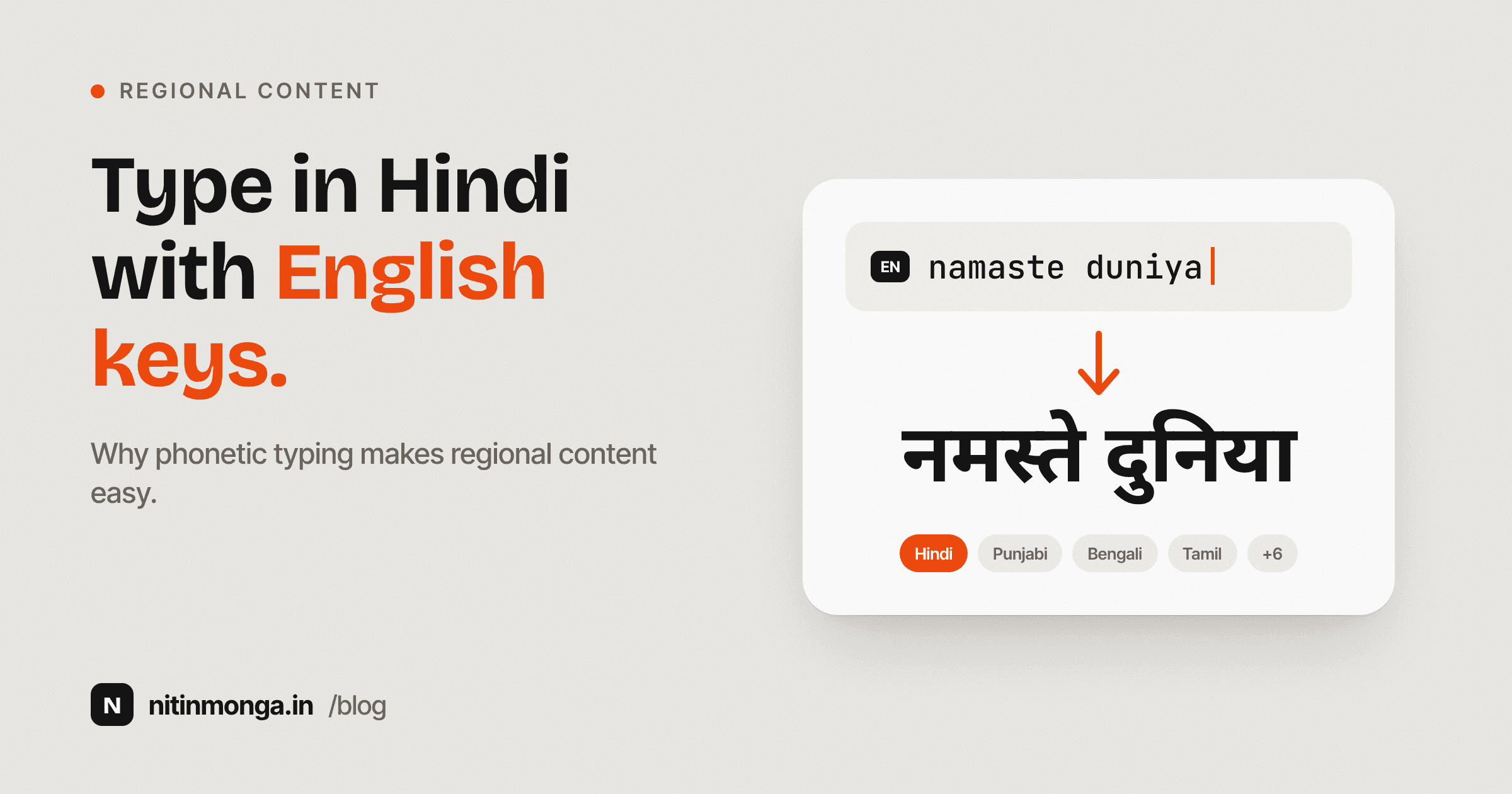
Designing for Indian Languages: Why Phonetic Typing Makes Regional Content Easier to Create
Speaking an Indian language and typing it fluently are two different skills. Phonetic transliteration reduces that gap by letting people type familiar sounds with an English keyboard and convert them into native scripts. This is why I built an Indian Language Typing Tool around simple phonetic input.
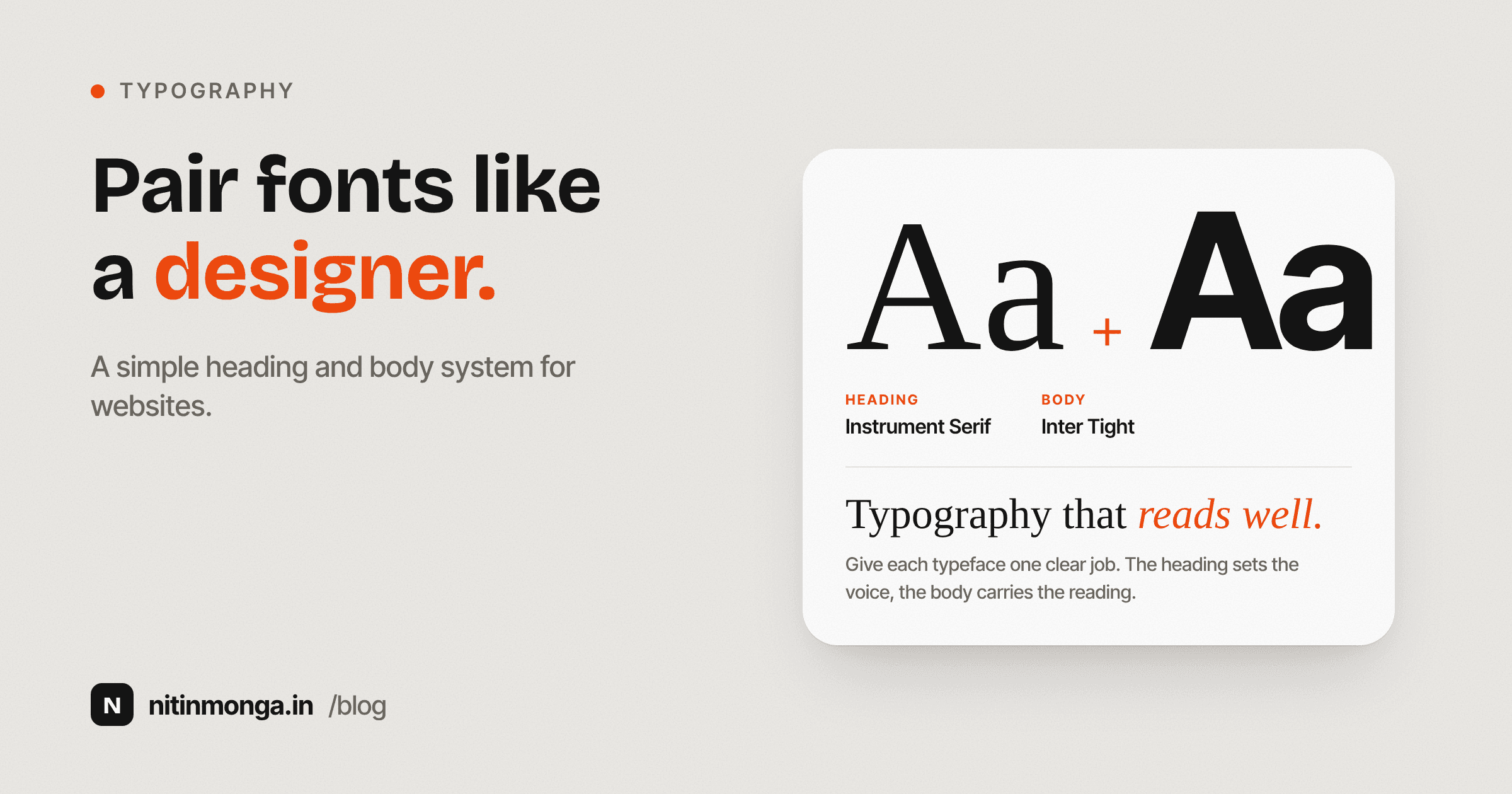
How I Pair Fonts for Websites: A Practical Typography System for Designers
Font pairing is not about finding two beautiful typefaces. It is about creating hierarchy, readability and a consistent voice across an entire interface. This is the practical approach I use when choosing heading and body fonts for websites.
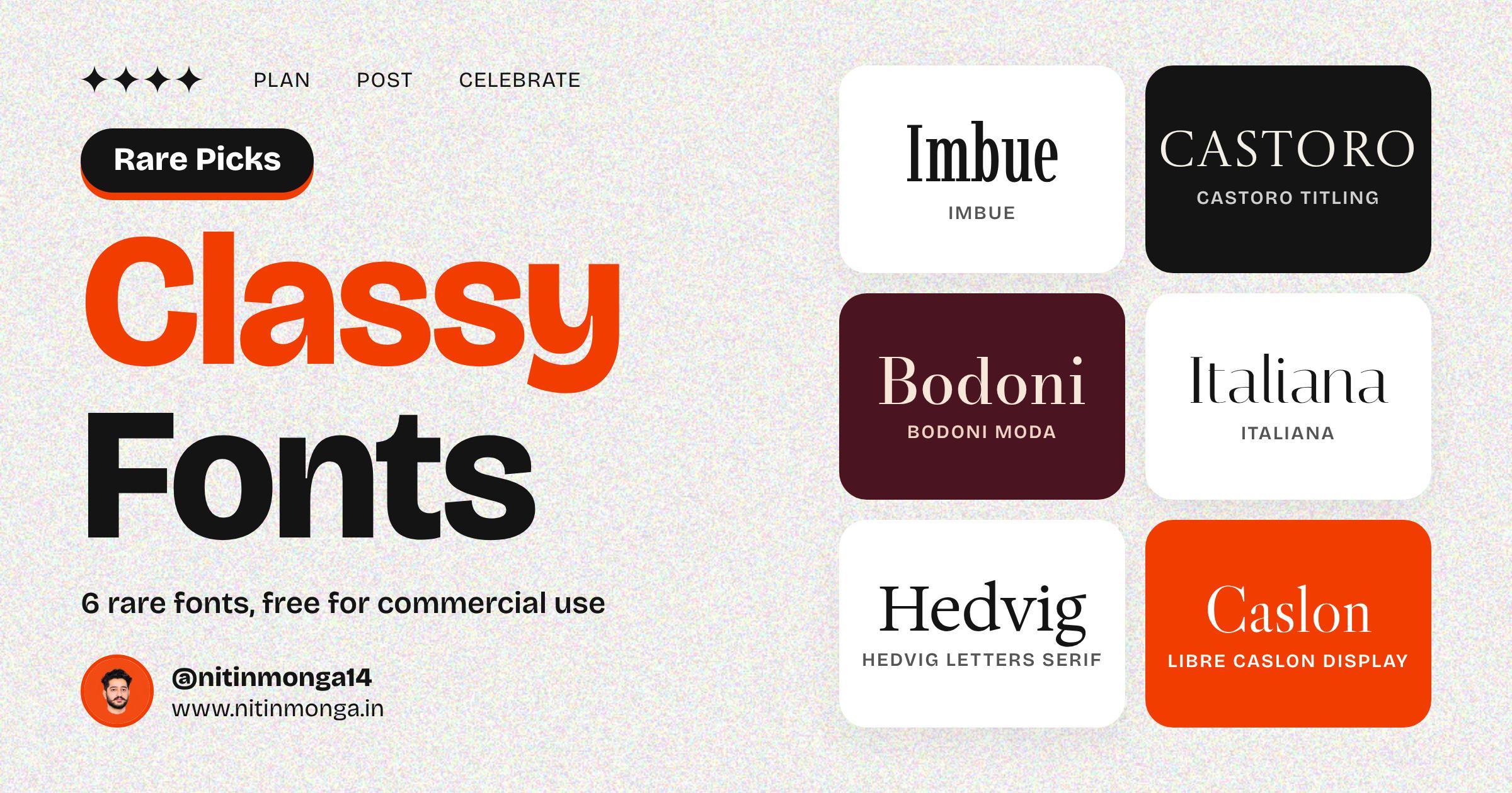
6 Rare Classy Fonts That Make Any Brand Look Expensive (Free for Commercial Use)
Every designer has a short list of fonts they reach for when a client says "make it look premium." The trouble is that everyone has the same list. Playfair Display, Montserrat, Cormorant. They are good fonts, but when the same type sits on every cafe menu and wedding card in town, it stops feeling special.
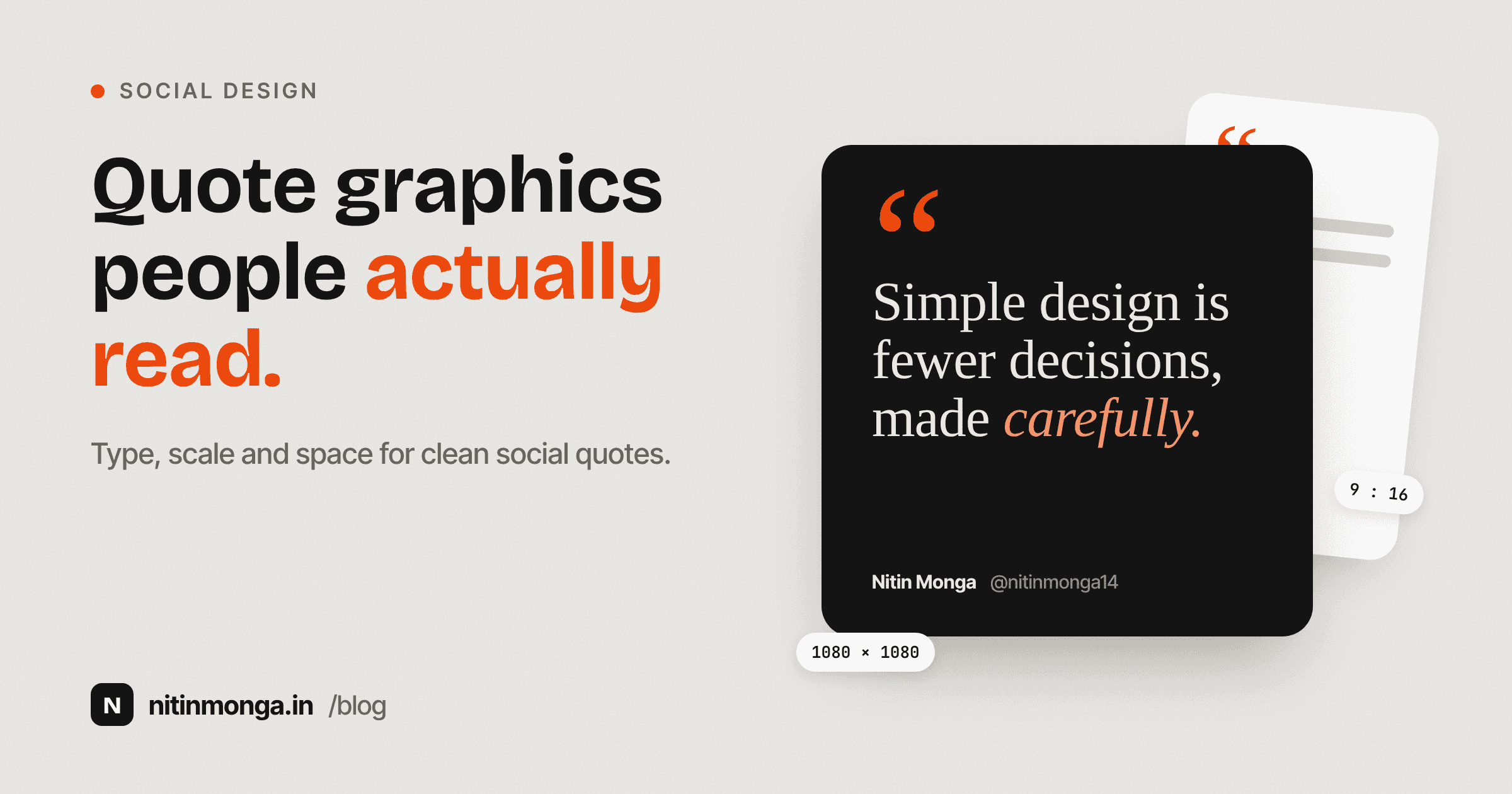
Designing Quote Graphics That People Can Actually Read: My Approach to Type, Scale and Space
A quote graphic looks simple because it may contain only a sentence, an author name and a background. That simplicity makes every typography decision more visible. This is how I approach quote design and why I built a Quote Creator around readable type, controlled scale and useful social formats.

Why QR Codes Should Be Designed Like Brand Assets, Not Added at the End
QR codes often appear at the final stage of a project, after the real design work is considered finished. I think that is the wrong approach. A QR code can be functional, readable and visually consistent with the brand at the same time. This is how I approach QR design and why I built Brand QR Studio.
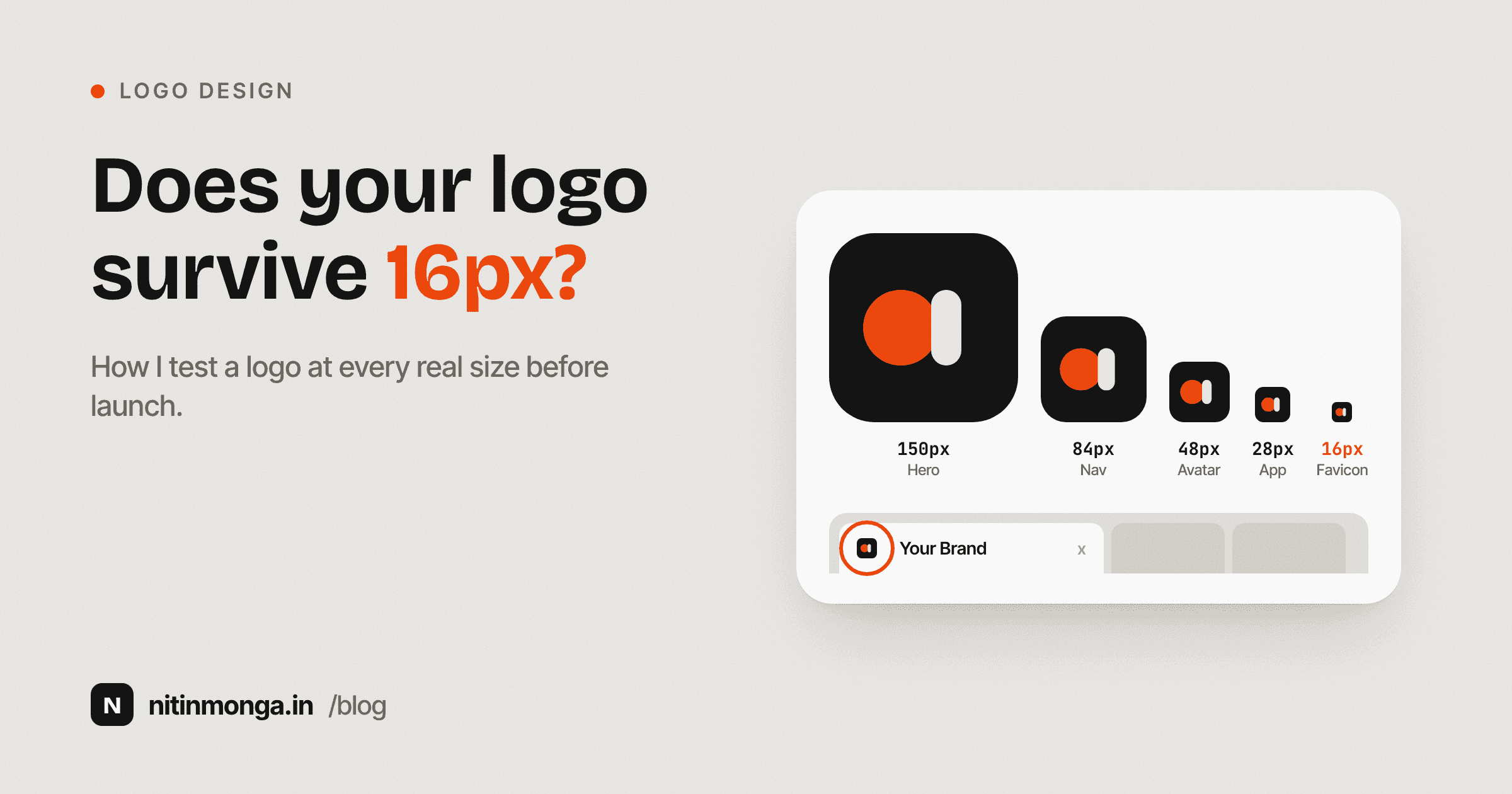
A Logo Is Not Finished Until It Works at 16 Pixels: How I Test Logos Across Real Sizes
A logo can look excellent on a presentation slide and fail completely as a favicon. Scale testing should happen during logo development, not after the identity is approved. This is the process I use to judge whether a logo can survive the sizes a real brand needs.
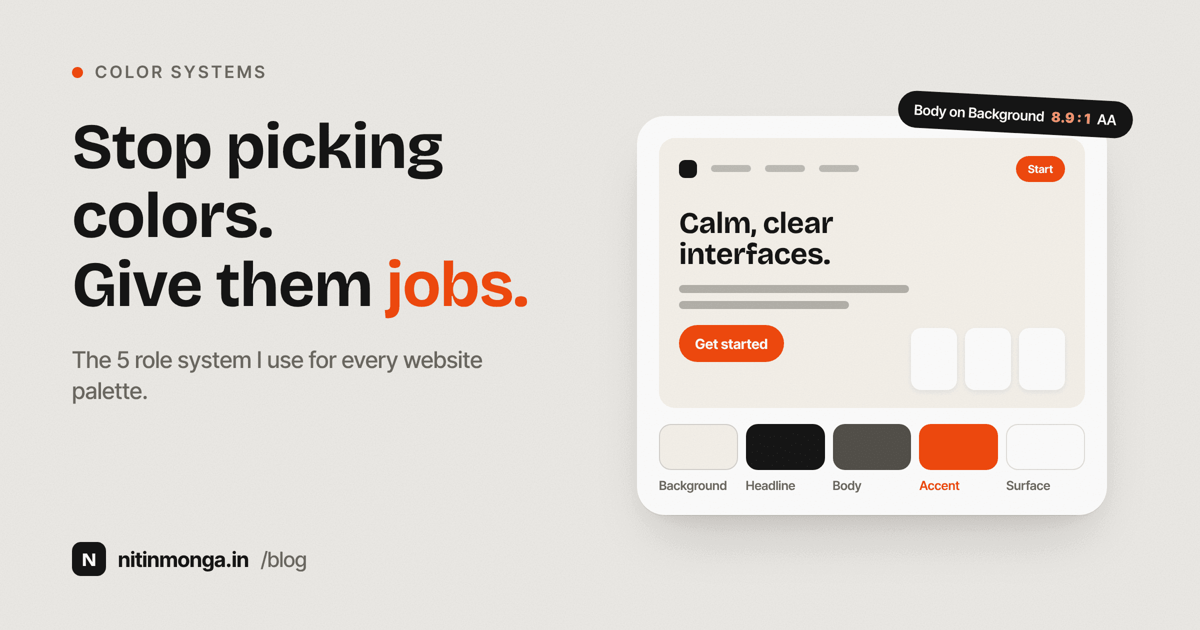
How I Choose Website Colors: A Practical System for Building Palettes That Work in Real Interfaces
Choosing five attractive colors is easy. Building a color system that still works across navigation, buttons, cards, text, backgrounds and real content is much harder. This is the process I use to evaluate website color palettes and why I built the Color Palette Generator and Extractor around color roles rather than random swatches.
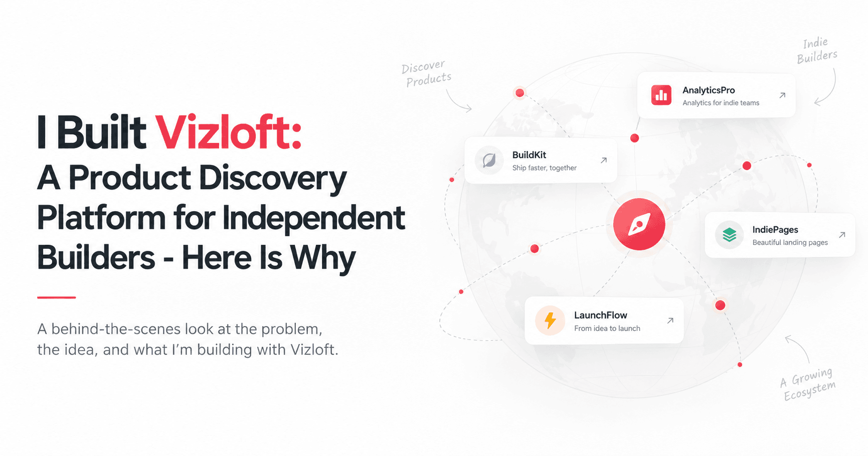
I Built Vizloft: A Product Discovery Platform for Independent Builders, Here Is Why
Nitin Monga, designer and developer from Punjab, built Vizloft - a free platform where independent builders list their products, explore builders on a live Atlas map, and find their people. This is the story behind it.
6 Best Logo Fonts to Download Free in 2026
If you've ever stared at a blank canvas trying to name-drop your brand into something memorable, you already know the truth: your logo font does 80% of the talking before anyone reads a single word of your tagline. A great logo font doesn't just spell out a name — it tells people whether your brand is playful or serious, modern or classic, approachable or premium, all in the space of a few letterforms.
Page 1 of 3 · 22 articles total