How I Pair Fonts for Websites: A Practical Typography System for Designers
Font pairing is not about finding two beautiful typefaces. It is about creating hierarchy, readability and a consistent voice across an entire interface. This is the practical approach I use when choosing heading and body fonts for websites.
Nitin Monga
Designer · Developer · 3D Artist
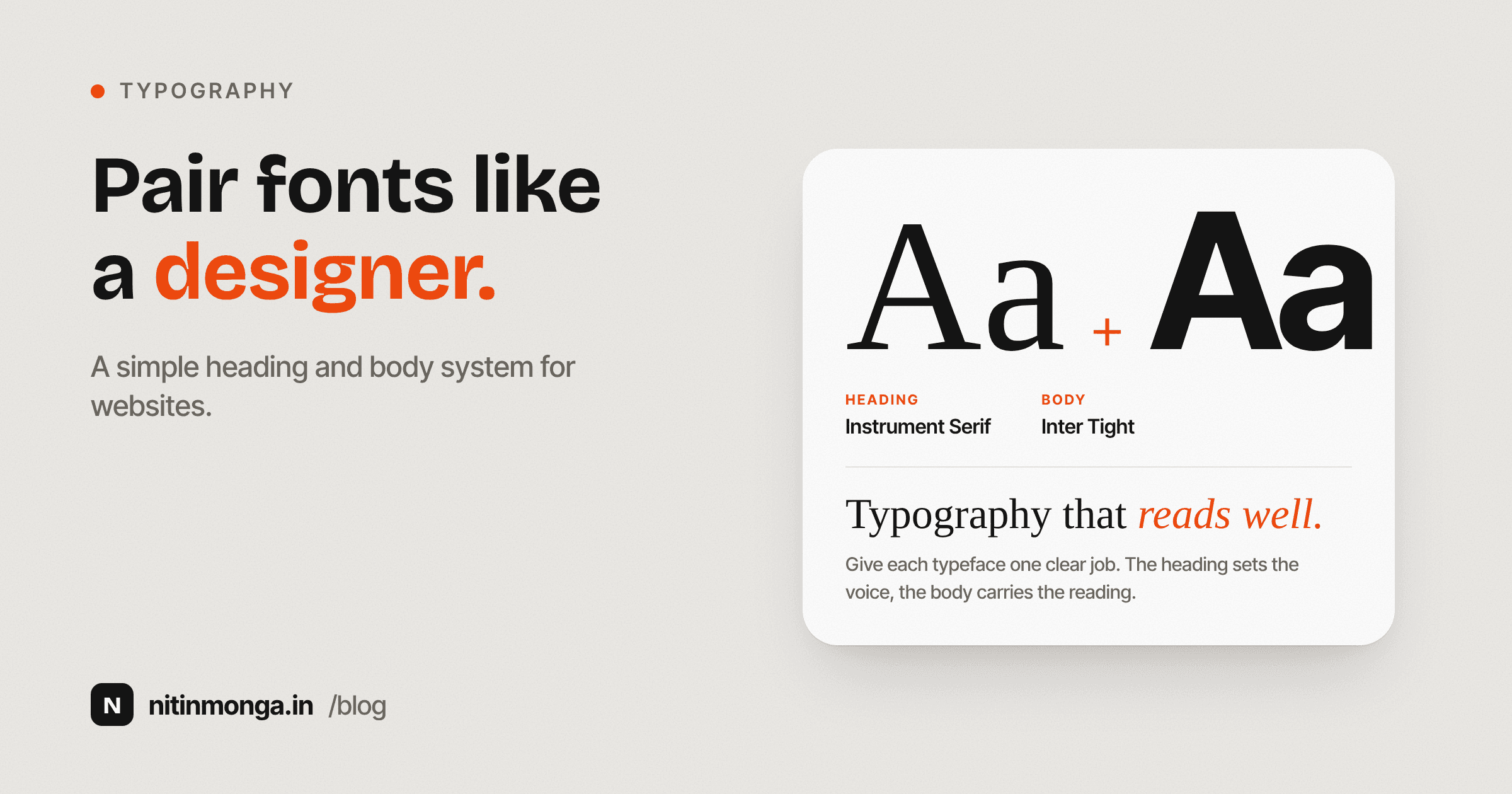
Two good fonts can still make a bad pairing
Designers often search for font pairings as if the goal is to find two individually attractive typefaces.
That is only part of the problem.
The real question is whether the two fonts can live together inside a complete website.
A heading font may look beautiful in a specimen.
A body font may be extremely readable.
Placed together, they may still feel unrelated.
They might share too much personality and compete.
They might have completely different proportions.
The body font might feel too mechanical beside a warm editorial serif.
The heading font may lose its character once real page content appears.
This is why I built Font Pairing Preview around a complete website layout instead of displaying two lines of sample text.
Typography needs context.
The two fonts need different jobs
My simplest starting point is to give each family a responsibility.
One handles display.
One handles reading.
The display face usually appears in major headings and moments where brand personality matters.
The body face handles paragraphs, navigation, forms, labels and supporting information.
Sometimes one family can do both jobs.
A large variable font family with a wide weight range can create an excellent single family system.
But when I use two families, I want the roles to be clear.
If both typefaces fight for attention, the pairing becomes unnecessary.
Contrast is more useful than similarity
A successful pairing often includes some contrast.
Serif with sans serif.
Geometric with humanist.
Expressive display with neutral body.
Mono with clean sans serif.
The fonts do not need to look related in every detail.
They need to feel intentional together.
If I pair two decorative serifs with strong personalities, the page can feel noisy.
If I pair two neutral sans serifs that are almost identical, I have added complexity without gaining much.
The relationship should create useful hierarchy.
Serif and sans serif combinations
This remains one of the easiest structures to control.
A serif can add character to headings.
A sans serif can make body copy feel clean and direct.
The contrast is obvious enough that the roles separate naturally.
That does not mean every serif works with every sans serif.
Proportion still matters.
A very delicate high contrast serif may feel uncomfortable beside a heavy industrial sans.
A wide heading font may make a narrow body face feel unrelated.
I look at overall tone before I look at category labels.
Same family pairings can work too
Using one family throughout a website can be extremely effective.
Montserrat for both heading and body, for example, creates a very different system from using an editorial serif and a sans serif.
The hierarchy then comes from scale, weight, spacing and width rather than family contrast.
This can make a product feel controlled and modern.
It can also improve loading performance because fewer font families are required.
The risk is monotony.
The designer needs to create enough typographic contrast through size and weight.
Body type has the harder job
Designers spend a lot of time choosing headline fonts because they create the strongest visual impression.
Body type deserves more practical attention.
Users may read hundreds of words in the body font.
It appears at smaller sizes.
It has to survive different devices.
Its punctuation, numerals, bold weight and links all matter.
I want body text that is comfortable before I want body text that is distinctive.
A highly expressive font may be wonderful at 60 pixels and exhausting at 16.
That is not a failure of the font.
It means the font is being used for the wrong job.
Heading fonts carry more personality
Headings have less text and more size.
That gives them room for character.
This is where I am more comfortable using unusual proportions, strong serifs or geometric shapes.
A fashion brand may benefit from a refined serif.
A software tool may feel better with a contemporary grotesk.
A creative studio can support something more expressive.
The heading font helps establish tone quickly.
But it still has to work across real heading lengths.
A font that only looks good in a two word hero may become awkward on a twelve word page title.
That is another reason live preview matters.
I test the pairing on real interface components
A heading and paragraph sample is not enough.
I want to see the fonts in navigation.
Hero text.
Cards.
Buttons.
Stats.
Testimonials.
Footer.
Small labels.
A typeface can behave very differently across these situations.
For example, a heading font with narrow letters may look elegant in a hero but weak in card titles.
A body font with a large x height may look excellent in paragraphs but visually oversized inside buttons.
The Font Pairing Preview applies the combination to a fuller interface because these problems are easier to see when the typography is doing real work.
Size relationship matters as much as font choice
A great pairing can still fail if the type scale is wrong.
If the hero heading is only slightly larger than body copy, the page loses hierarchy.
If card titles are almost the same size as section headings, the structure becomes unclear.
Typography is a system of levels.
I usually think in terms of:
Hero.
Page heading.
Section heading.
Card heading.
Body.
Small text.
Caption.
The exact sizes depend on the design, but the relationships should be visible.
Changing the fonts cannot compensate for a weak scale.
Weight can solve problems before adding another font
If the design feels flat, I first explore weights.
Regular.
Medium.
Semibold.
Bold.
A single typeface can produce several levels without needing a second family.
This is particularly useful in product UI, where consistency often matters more than editorial personality.
I prefer to add typefaces because they create useful contrast, not because the page feels boring.
Good spacing and weight choices can solve a surprising amount.
Brand personality should guide the pairing
I do not believe in one universal list of best font combinations.
A pairing is best for something.
A luxury brand.
A SaaS dashboard.
A restaurant.
A developer portfolio.
A financial service.
A magazine.
These contexts want different voices.
The same Playfair Display combination that works beautifully for an editorial studio may feel inappropriate for a dense infrastructure monitoring dashboard.
I choose personality before popularity.
Technical products need typography too
Developers sometimes treat typography as a decorative layer added after the interface is finished.
In product design, typography is part of information architecture.
Tables.
Settings.
Logs.
Metrics.
Navigation.
Documentation.
All of these depend on readable text.
Technical brands sometimes benefit from mono typefaces in controlled situations because monospaced forms reference code and systems.
That does not mean the entire product should use monospace.
A small amount of the right character is usually stronger than applying it everywhere.
Editorial brands need restraint
Serif typography can immediately make a site feel editorial.
That can be useful.
It can also become a cliché if every heading, paragraph, quote and label uses a dramatic serif.
I often prefer the serif where it has room to breathe and a neutral body face for longer text.
The contrast makes the editorial character stronger because it has something calm beside it.
Personality needs space around it.
Font loading is part of the design decision
Web fonts have a technical cost.
Each family and weight can add files and network requests.
If I select two families and then load six weights from each, the typography decision may hurt performance unnecessarily.
Most websites do not need every available weight.
I try to know which weights are actually used.
Maybe 400 for body.
500 for controls.
700 for headings.
The exact values depend on the family.
The important part is being deliberate.
The Font Pairing Preview provides CSS so the visual decision can move into implementation without requiring the developer to reconstruct it manually.
Variable fonts change the equation
Many modern type families are available as variable fonts.
A variable font can provide a continuous range of weights and sometimes width, optical size and other axes within a more flexible file structure.
This can reduce the need for multiple static font files.
It also opens more precise typography.
But more control is not automatically better.
If the design system uses arbitrary weights everywhere, consistency suffers.
I still prefer a small defined set of text styles even when the technology allows hundreds of possible values.
Optical size and actual rendering
Typography in a design tool is not always identical to typography in a browser.
Rendering engines differ.
Font smoothing differs.
Operating systems differ.
Variable font behaviour can differ.
This is why I like evaluating final type in the medium where it will be used.
A website font pairing should eventually be judged in a browser.
The preview gets closer to that environment than a static screenshot of two font names.
Line height matters enormously
A font can appear unreadable simply because the line height is wrong.
Body copy needs enough vertical space for the eye to move comfortably.
Too tight and paragraphs become dense.
Too loose and lines stop feeling connected.
Different typefaces need different line heights because their x height and proportions vary.
There is no magic value that fits every family.
I adjust based on the actual text.
This is another reason selecting a font is only the beginning of typography.
Letter spacing needs restraint
Designers often add tracking to uppercase labels.
That can work well.
Applying wide tracking to normal paragraphs usually does not.
Large display headings may sometimes benefit from tighter spacing.
Again, the font itself matters.
Some families are already carefully spaced for their intended use.
I do not want to override those decisions automatically.
I adjust letter spacing when there is a visible problem or a specific stylistic reason.
Test numbers, not just letters
A website often contains prices, dates, percentages, statistics and phone numbers.
Some fonts have distinctive numerals that can become distracting.
Financial products in particular need clear numeric typography.
If the design includes tables or dashboards, I want to see how numbers align.
A pairing that looks excellent in marketing copy may need additional consideration inside data heavy screens.
Test punctuation and symbols
Ampersands.
Quotation marks.
Currency symbols.
Arrows.
Brackets.
These details contribute to the tone.
A font with beautiful letters but awkward symbols may create problems in a specific product.
This is more noticeable in editorial design and brands using a lot of stylised copy.
For multilingual work, language support becomes even more important.
Do not approve a typeface based only on A to Z if the real project uses far more characters.
I avoid using too many families
Two is usually enough.
Sometimes one is better.
A third family can work for a very specific role, such as code, but it should earn its place.
Every additional typeface increases visual complexity and technical complexity.
A brand does not become richer simply because more fonts are present.
It becomes richer when a small number of typographic rules are used well.
How I evaluate a pairing
I first look at personality.
Does this combination match the brand?
Then hierarchy.
Can I tell what is important immediately?
Then reading.
Would I be comfortable reading several paragraphs in the body face?
Then interface use.
Do buttons, navigation and cards still feel coherent?
Then implementation.
Are the necessary weights available?
Is the font practical to load?
Does it contain the characters the project requires?
A good pairing survives all five questions.
Why I built Font Pairing Preview
There are plenty of lists showing popular font combinations.
Lists are useful for discovery.
They are less useful for decision making.
I wanted to click a pairing and immediately see it acting like website typography.
Not simply the alphabet.
Not one headline.
A complete enough interface to reveal whether the combination still feels right after several components.
The tool contains curated starting points rather than every font on Google Fonts.
That is intentional.
Too much choice can make a small design decision take longer than it deserves.
Final thoughts
Font pairing is not about proving that two typefaces look attractive together.
It is about creating a useful relationship.
One font may carry personality.
Another may carry reading.
Or one family may handle everything through size and weight.
The right answer depends on the brand and the product.
Test the fonts with real words.
Test long headings.
Test buttons.
Test paragraphs.
Test numbers.
Test mobile.
Then implement only the weights you genuinely need.
Typography works when the user understands the page before thinking about the fonts.
Tagged
Nitin Monga
Graphic Designer, 3D Artist & Full-Stack Developer based in Punjab, India. Designing and building digital products since 2013.