Designing Quote Graphics That People Can Actually Read: My Approach to Type, Scale and Space
A quote graphic looks simple because it may contain only a sentence, an author name and a background. That simplicity makes every typography decision more visible. This is how I approach quote design and why I built a Quote Creator around readable type, controlled scale and useful social formats.
Nitin Monga
Designer · Developer · 3D Artist
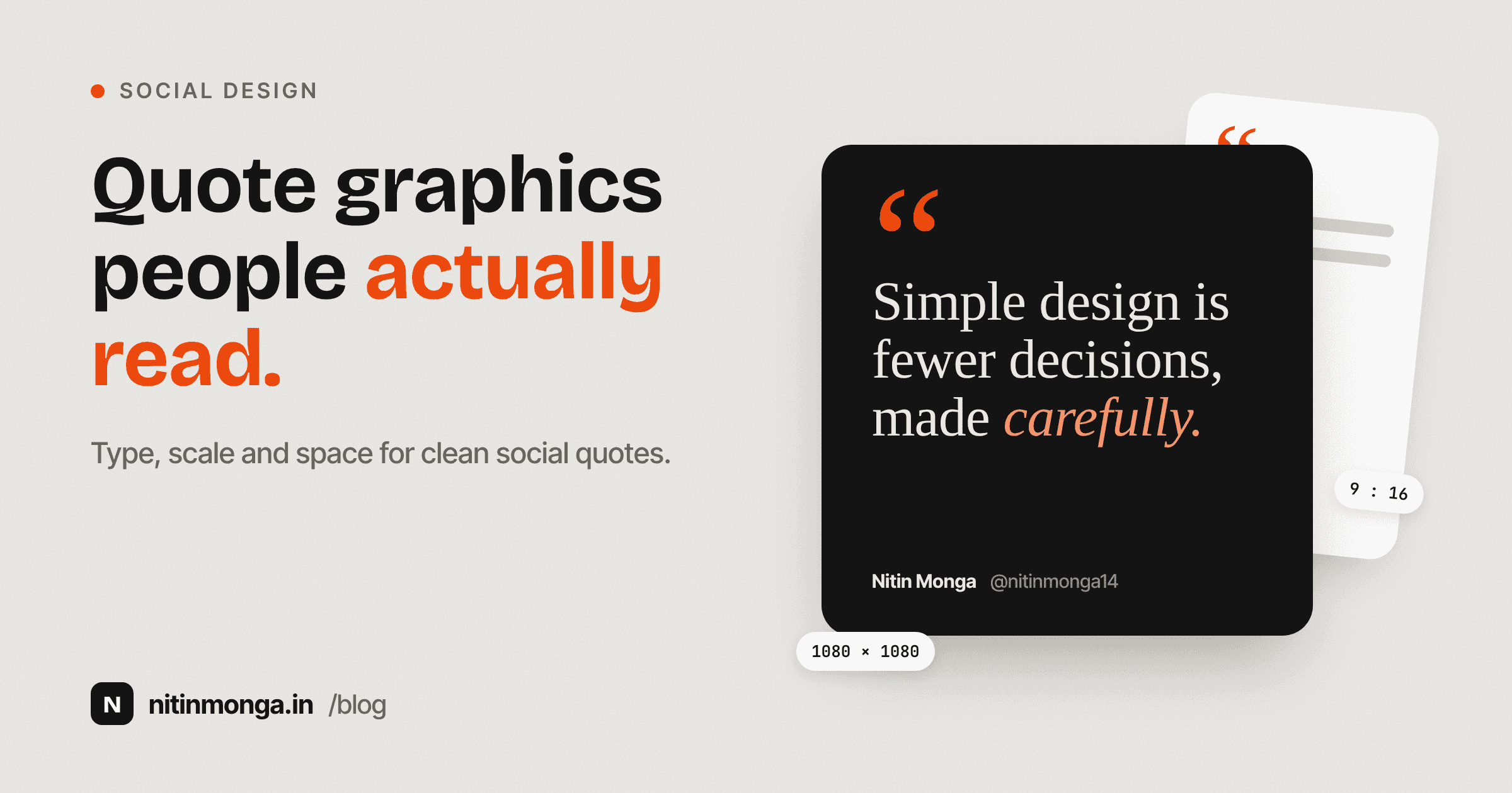
Simple graphics expose bad decisions quickly
A quote card may have fewer elements than almost any other social post.
There is no product photography.
No complicated interface.
No long copy.
Often there are only three things.
The quote.
The attribution.
The background.
That sounds easy.
In practice, the lack of elements means there is nowhere for weak typography to hide.
If the line breaks are awkward, you notice them.
If the font is wrong, you notice it.
If the quote sits too close to the edge, you notice it.
If the attribution competes with the quote, the hierarchy feels wrong immediately.
This is why I enjoy quote graphics as a typography exercise.
They are simple enough that the fundamentals become obvious.
I start with the words
Before choosing a font, I read the quote.
Not every quote wants the same visual treatment.
A reflective sentence may suit a calm serif.
A short confident statement may support a stronger display face.
A personal handwritten line can work with a script style if readability remains good.
The words should influence the visual tone.
I do not want to choose a font simply because it looks attractive in the font menu.
Typography is part of the message.
Quote length changes the entire layout
A five word quote and a fifty word quote cannot use the same size.
This seems obvious, but fixed templates often pretend otherwise.
The short quote ends up looking too small.
The long quote overflows or becomes cramped.
This is why the Quote Creator includes automatic sizing based on the amount of text.
The idea is practical.
Shorter text can carry more visual presence.
Longer text needs more room and more restraint.
I still like having manual size controls because automatic behaviour cannot know the exact emphasis I want.
But auto sizing is a useful starting point.
Line breaks are design decisions
One of the biggest differences between a random quote image and a carefully designed one is line breaking.
A browser can wrap text automatically.
That does not mean the result has good rhythm.
Consider:
Design is not
what it looks like
and feels like.
Versus:
Design is not what
it looks like and
feels like.
The words are identical.
The reading rhythm is not.
I often insert manual line breaks when a sentence has a natural pause or when one phrase deserves stronger emphasis.
The goal is not to create a shape for its own sake.
The goal is to make the line structure support the way the quote should be read.
Alignment affects personality
Centered quote text feels formal and self contained.
Left aligned text often feels more editorial.
Right alignment can work in specific compositions but requires more care.
There is no universal correct answer.
For social quote cards, center alignment is popular because it works with many short statements and balances easily inside a square.
For longer quotes, I often prefer left alignment because the eye can return to a consistent starting point on each line.
The Quote Creator keeps the composition focused rather than providing every possible layout option.
I would rather have a small number of predictable structures than hundreds of controls that turn a quick tool into design software.
Font personality matters
Typefaces carry tone before the viewer consciously reads the text.
A refined serif can make a quote feel editorial.
A geometric sans serif feels more contemporary.
A bold display face can turn a short statement into a poster.
A handwritten font feels personal but becomes tiring when used for long passages.
The important thing is matching personality to content.
I do not use a decorative font simply because the quote is inspirational.
Sometimes the strongest treatment is extremely plain.
Good typography does not need to announce itself.
Display fonts need room
One mistake I see often is using an expressive display font at small sizes.
Display faces are usually designed to create character in headings.
Their unusual shapes may become difficult to read when the text becomes dense.
If a quote is long, I prefer a calmer face or a smaller degree of typographic personality.
If the quote is short, a display face has more room to work.
This is one reason the tool includes different font categories instead of one default treatment.
The designer should be able to choose mood without sacrificing readability.
Color should support the text
Quote graphics are often shared quickly.
People see them while scrolling.
The text needs to be readable immediately.
I prefer strong contrast between quote and background.
Black or very dark text on a light background remains dependable.
White or very light text on a dark background can also work well.
Brand colors can be introduced carefully, but I do not want them to make the words harder to read.
A quote post is communication first.
If the message becomes difficult to read because the palette looked attractive in the editor, the design has failed its main purpose.
The background can be almost invisible
A simple background is not a weakness.
In many quote cards, the background should do very little.
It establishes mood.
It creates contrast.
It may carry a brand color.
Then it gets out of the way.
I see designers overcomplicate quote posts by adding textures, shapes, gradients, quotation marks and decorative lines everywhere.
Every decorative object reduces the amount of quiet space around the words.
Sometimes those details belong.
Often they do not.
The quote itself is already the content.
Attribution needs its own level
The author's name should be visible without competing with the statement.
That usually means smaller type, softer contrast or more separation.
I want the viewer to read the quote first.
Then, if they care, the attribution.
If the author's name is as large as the statement, the hierarchy becomes confused.
The same applies to a brand handle.
Branding should be present enough for attribution, especially when the graphic is shared away from the original account, but it should not become the headline.
Social formats have different proportions
A square post and a vertical story are not the same composition stretched into different dimensions.
The available space changes.
A square is compact and balanced.
A vertical story has much more height and often more opportunity for breathing room.
If the same text is placed in both, the line breaks and scale may need to change.
The Quote Creator produces square and story formats because these are common real publishing situations.
I still recommend reviewing both outputs individually.
Automatic layout can create a useful composition, but the designer should decide whether the quote feels equally strong in each aspect ratio.
Safe areas matter
Social platforms add interface elements around stories.
Profile information.
Reply fields.
Reaction controls.
Progress indicators.
Text placed too close to the top or bottom may technically exist in the image but feel crowded once the platform interface appears over it.
This is why I prefer generous margins.
The same principle improves feed posts.
A quote touching the edge of a 1080 pixel canvas usually feels less confident than one with deliberate space around it.
Space is part of the typography.
Quote cards need brand consistency
If a brand publishes quotes regularly, each post should not feel like a completely new identity.
That does not mean every graphic must be identical.
It means the typography, color treatment, spacing and attribution should share a system.
Maybe the brand always uses the same headline typeface.
Maybe the handle sits in the same location.
Maybe backgrounds rotate through approved colors.
A reusable quote tool becomes much more useful when these choices are treated as brand rules instead of random settings changed for every post.
Templates can become visually lazy
There is a reason social media tools are full of templates.
They make production fast.
The problem is that templates encourage people to keep every decorative decision even when it does not fit the content.
A quote with eight words and a quote with eighty words should not look identical.
I prefer a system that adapts around the text.
The words should remain the primary variable.
Everything else supports them.
Why I keep quote length controlled
The Quote Creator limits the amount of text because a social graphic is not a page of a book.
At some point a quote becomes too long for the format.
The type gets smaller.
The line count grows.
The viewer sees a wall of text while scrolling.
If a statement needs several paragraphs to make sense, it may belong in a carousel, caption or article instead.
Design has to respect the medium.
A quote card is strongest when the idea can be absorbed quickly.
Server rendering and output quality
The final image should not feel like a screenshot of a browser preview.
For downloadable graphics, I want a clean full resolution output.
That is why the Quote Creator renders the final card as a proper image rather than asking the user to take a screenshot of what they see.
The square output is designed for social feed use.
The vertical output is designed for story format.
The technical process should stay behind the scenes.
The user should simply receive a sharp PNG at a useful size.
A quote generator still needs human judgment
The tool can handle typography, scaling, color and export.
It cannot tell you whether a quote is correctly attributed.
It cannot guarantee that the wording you found on social media was actually said by the person whose name is attached to it.
This is especially important with famous quotes.
Misattributed quotes spread quickly because people copy graphics without checking the source.
If attribution matters, verify it.
Design can make information look authoritative very easily.
That makes accuracy more important, not less.
Copyright deserves attention too
Not every piece of text is automatically free to reproduce commercially.
Very short familiar statements may create little practical concern, but longer excerpts from books, songs, speeches or contemporary writing can be protected.
The tool helps design the graphic.
It does not grant rights to someone else's writing.
If I am creating content for a commercial brand, I want to know where the words came from and whether I have a right to use them.
Again, design quality does not replace content responsibility.
My usual quote design process
I start by cleaning the text.
I remove unnecessary quotation marks unless they are visually useful.
I check the attribution.
I decide whether the statement is short, medium or long.
Then I choose the typeface.
After that I adjust size and line breaks.
Only then do I choose the final color relationship.
This order keeps me focused on communication.
If I start with decorative styling, I can waste time making a beautiful layout that does not suit the words.
Why I built the Quote Creator
I wanted a tool for a specific recurring task.
Create a clean quote graphic.
Choose typography.
Use the right social dimensions.
Export without a watermark.
I did not want to reproduce a complete design editor.
For more complex social media design, Figma, Photoshop and other tools are better.
A focused utility should stay focused.
The Quote Creator is for the moment when the idea is already simple and the designer wants a clean image quickly.
Final thoughts
Quote graphics are typography exercises disguised as easy social content.
The fewer elements you have, the more each decision matters.
Choose a font that suits the words.
Use enough contrast.
Control the line breaks.
Protect the margins.
Keep attribution secondary.
Use decoration only when it helps the composition.
Review the square and vertical versions separately.
And verify the quote itself before making it look official.
Simple design is not the absence of decisions.
It is the result of making fewer decisions carefully.
Tagged
Nitin Monga
Graphic Designer, 3D Artist & Full-Stack Developer based in Punjab, India. Designing and building digital products since 2013.