Why Every Finished Design Needs a Copy Check: How I Proofread Text Inside Visuals
Designers can spend hours adjusting layout and stop noticing the words sitting inside it. A spelling mistake in packaging, a social creative or a user interface can survive several design reviews because everyone is looking at the visual treatment. This is how I approach proofreading finished designs and why I built a proofreader that works from the design image itself.
Nitin Monga
Designer · Developer · 3D Artist
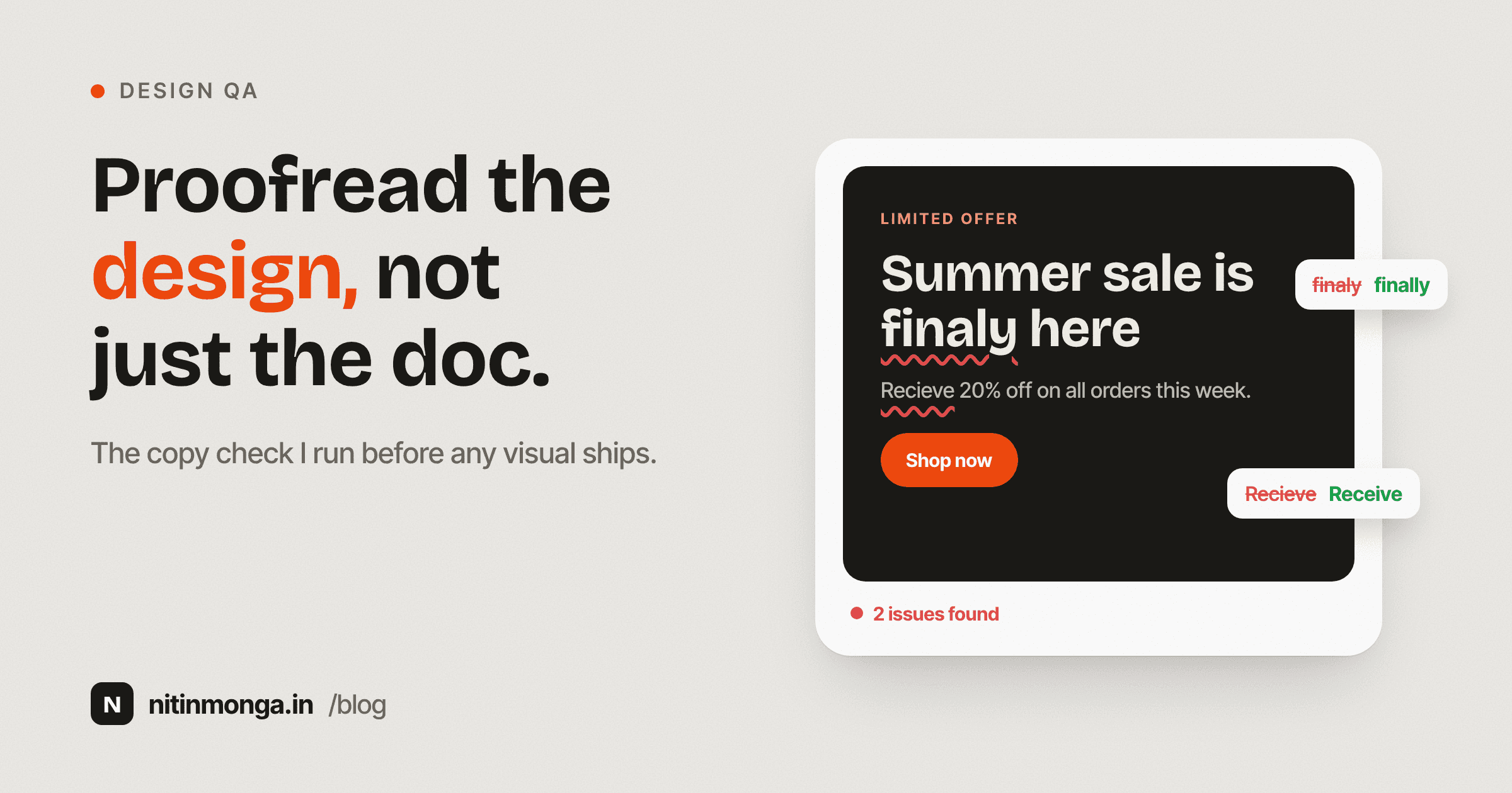
Designers stop reading when they start designing
When I first receive copy, I read it as language.
Once I start designing, something changes.
The headline becomes a shape.
The paragraph becomes a gray block.
A button label becomes a small component.
The words slowly turn into visual objects.
This is useful because designers need to think about hierarchy and composition.
It also creates a problem.
After looking at the same text for two hours, I may stop actually reading it.
A typo can sit in the middle of a beautiful layout and become almost invisible to the person working on the file.
This is why I believe final design proofreading needs to happen after the visual work feels complete.
Traditional spell checking does not see the final artifact
If the original copy came from Word or Google Docs, it may have been spell checked before it entered the design.
That does not mean the final design is clean.
Text changes during production.
A line gets shortened.
A CTA changes.
A client asks for one word to be replaced.
A price is added.
A disclaimer moves.
A product name is copied manually.
The final image contains the version that actually matters.
The problem is that traditional proofreading tools usually work on text documents.
The Design Proofreader I built works from an exported image instead.
That makes it useful later in the workflow.
The finished design is the truth
A source document can be perfect while the final artwork contains a typo.
For print, the artwork is what goes to production.
For social media, the exported image is what gets published.
For UI, the screen is what the user sees.
I want the copy check to look at the artifact that is about to leave the design process.
This is why I prefer exporting a JPG, PNG or WebP and checking that version.
It catches errors introduced after the original text was approved.
Packaging is where mistakes become expensive
A social post can usually be corrected.
Packaging may already be printed.
Thousands of units can contain the same error.
A misspelled product claim, ingredient name or instruction can become more than an embarrassing typo.
Depending on the information, it can create regulatory or commercial problems.
No automated proofreader should be treated as final legal approval for packaging.
But adding another visual copy check before print is still valuable.
I would rather have one more opportunity to catch something than assume the PDF is clean because several people have already looked at it.
Social graphics move too quickly
Social teams often work under tight deadlines.
Design.
Approval.
Revision.
Export.
Publish.
A typo in the CTA or headline can go live immediately.
The designer may have read the sentence ten times and still missed it because they were thinking about line breaks rather than spelling.
For social media work, a quick image proof before publishing is a small step with a clear benefit.
UI copy has different risks
Interface text is often short.
That can make mistakes more visible.
A misspelled button label looks careless.
A settings screen with inconsistent terminology creates confusion.
Error messages can contain text that was never present in the main design review.
UI also contains many small text elements.
Navigation.
Labels.
Tooltips.
Forms.
Empty states.
Helper text.
A design proofreader can help inspect the visible screenshot, but it cannot replace product copy review across all application states.
It only sees what is present in the image you provide.
That limitation matters.
Text extraction comes before proofreading
When proofreading an image, the first problem is not spelling.
It is reading the image accurately.
Small text can be missed.
Decorative fonts can be misread.
Text placed over a photograph can become difficult to extract.
Curved packaging labels create another challenge.
The Design Proofreader uses visual text extraction before it evaluates likely spelling errors.
That means every result depends partly on whether the text was read correctly in the first place.
This is why I want users to review the extracted wording and suggestions rather than accepting them blindly.
English proofreading can use dictionaries
English has mature spelling dictionaries.
A dictionary can help identify words that are not recognised.
That still does not make spelling a simple yes or no problem.
Brand names may not exist in the dictionary.
Product names may look incorrect even when they are intentional.
Industry terminology may be unusual.
Names and places vary.
The tool therefore needs to combine detection with restraint.
A proofreader that flags every unfamiliar word becomes noisy very quickly.
Hindi requires different judgment
Hindi spelling includes matras and character combinations that do not map neatly to English proofreading logic.
A word may look visually similar while one matra changes the spelling.
The tool can provide likely corrections.
I would not use automated Hindi proofreading as final linguistic approval for high stakes material.
A native language reviewer remains important.
The tool is a second check.
Not an authority.
Punjabi creates the same need for review
Punjabi written in Gurmukhi has its own spelling patterns.
Names, colloquial language and regional usage can vary.
Automated analysis can help catch obvious mistakes.
It can also misunderstand intentional language.
This is why the current tool explicitly needs human review for Hindi and Punjabi output.
I would rather describe that limitation clearly than pretend the system has accuracy measurements that do not exist.
Proper nouns should not become noise
Imagine a poster containing a brand name that is not a dictionary word.
If the proofreader marks it as an error every time, the user quickly stops trusting the results.
The same applies to people's names.
Company names.
URLs.
Usernames.
Hashtags.
Some forms of text should be treated cautiously.
The tool is intended to find likely mistakes, not enforce a dictionary against every visible token.
ALL CAPS is not a spelling error
Designers use uppercase for labels and headlines.
A word written in uppercase should not be flagged simply because the casing is unusual.
The same applies to numbers, email addresses and symbols.
Proofreading needs enough context to separate language from formatting.
This is where image based review differs from a basic spell checker.
The text lives inside a visual composition.
I proofread content in passes
I do not try to check everything at once.
The first pass is spelling.
Are the words correct?
The second is grammar and punctuation.
Does the sentence make sense?
The third is consistency.
Are we writing Sign in on one screen and Login on another?
Are dates formatted the same way?
Are percentages spaced consistently?
The fourth is factual.
Is the price correct?
Is the phone number correct?
Is the legal entity name correct?
Is the offer end date correct?
A spelling tool only assists with part of this process.
Professional proofreading remains broader.
Numbers deserve a separate check
Spell checkers are not good at telling you whether 25 percent should have been 20 percent.
They cannot know whether a phone number belongs to the correct branch.
A date can be formatted perfectly and still be wrong.
For campaign and packaging work, I check numerical information separately.
This is one of the most important limitations of automated proofreading.
A design can contain no spelling mistakes and still contain a serious content error.
Layout can create copy mistakes too
Sometimes the words are correct but the design changes their meaning.
A line breaks in a confusing place.
A price is visually associated with the wrong product.
A disclaimer is separated from the claim it qualifies.
A heading appears to belong to the wrong card.
This is not spelling.
It is information design.
The final review should therefore include both copy and visual relationships.
Small print is worth checking deliberately
Designers naturally focus on large text.
Headlines.
Offers.
Primary CTA.
Small print receives less visual attention, which is exactly why errors survive there.
Packaging details.
Terms.
Footer information.
Labels.
Contact details.
The Design Proofreader attempts to inspect visible small copy, but very tiny or low contrast text may not be read reliably.
For print projects, I still zoom into the actual source file and review small text manually.
Do not use screenshots that are too compressed
Image quality affects text recognition.
If I take a heavily compressed screenshot and ask a system to read ten pixel text, I am creating unnecessary uncertainty.
I prefer a clean export.
Enough resolution.
No unnecessary compression.
Text large enough to inspect.
The proofreader accepts common image formats, but the quality of the source still matters.
Garbage in, garbage out applies to visual text extraction too.
Privacy deserves attention
Finished designs can contain confidential information.
Unreleased campaigns.
Client names.
Internal product screens.
Personal data.
The Design Proofreader uses server processing and external AI for visual analysis, and the processed image can be stored as part of the current tool flow.
That means I do not recommend uploading confidential artwork simply because checking it would be convenient.
Tool transparency is part of trust.
If a workflow contains sensitive material, use an appropriate internal process instead.
Why I built the Design Proofreader
The idea came from a very practical design problem.
Design software is excellent at layout.
It is not always an excellent final proofreading environment.
By the time a creative is ready, I want to inspect the exact visual output without rebuilding the text in another document.
Upload the design.
Read what the system detected.
Review likely spelling problems.
Return to the original design file and correct them there.
That is the complete workflow.
What the tool cannot promise
It cannot guarantee a design is error free.
It cannot reliably verify every regional language word.
It cannot check whether a product claim is legally valid.
It cannot know that a phone number is incorrect.
It cannot see text that is unreadable in the image.
It cannot replace a native language expert.
It cannot replace client approval.
I consider these limitations normal.
Useful software does not need to pretend it is perfect.
My final preflight routine
Before publishing or sending a design to print, I check the image as a viewer.
Then I check the words.
Then numbers and dates.
Then brand terminology.
Then contact information.
Then legal or technical content that needs specialist approval.
If the design contains Hindi or Punjabi, I prefer a language review when the project is important.
Then I look at the actual export one final time.
This process takes less time than fixing a public mistake.
Final thoughts
Designers should not assume that visual review equals copy review.
Once words become part of a composition, our attention changes.
We see shape.
Balance.
Alignment.
Typography.
That is exactly when spelling mistakes can hide in plain sight.
A design proofreader gives me another pass over the finished artifact.
I still make the final decision.
I still verify high risk information manually.
I still involve language specialists when necessary.
The tool is useful because it adds another checkpoint.
For something about to be published or printed, another careful checkpoint is rarely a bad idea.
Tagged
Nitin Monga
Graphic Designer, 3D Artist & Full-Stack Developer based in Punjab, India. Designing and building digital products since 2013.