6 Rare Classy Fonts That Make Any Brand Look Expensive (Free for Commercial Use)
Every designer has a short list of fonts they reach for when a client says "make it look premium." The trouble is that everyone has the same list. Playfair Display, Montserrat, Cormorant. They are good fonts, but when the same type sits on every cafe menu and wedding card in town, it stops feeling special.
Nitin Monga
Designer · Developer · 3D Artist
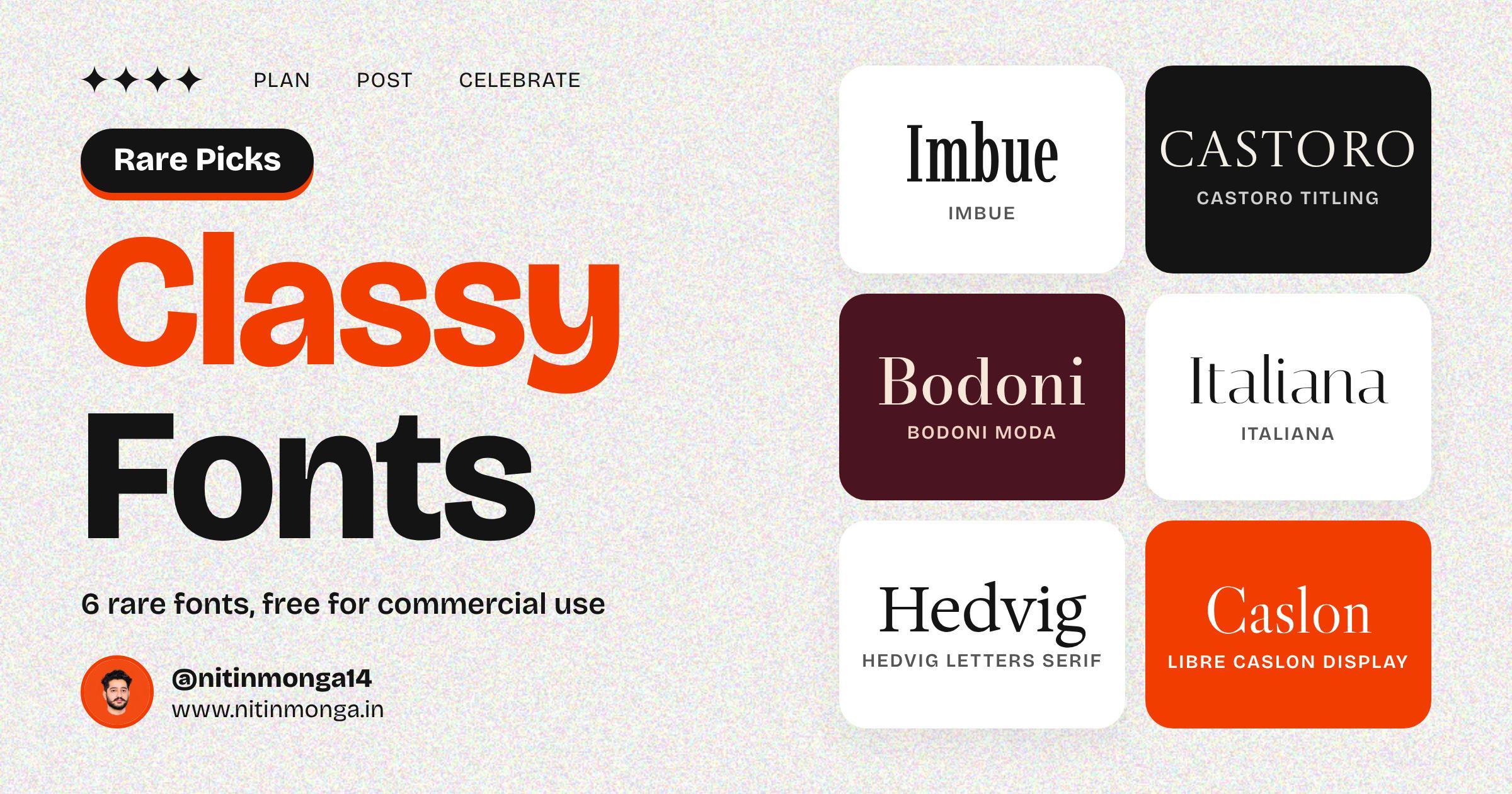
So I went looking for fonts that feel elegant but still look fresh. These six are rarely seen on Instagram feeds, and every one of them is free for personal and commercial use. You can put them in client logos, packaging, social posts and print without paying a license fee.
For each font I have written what it is best for, a pairing that works, one practical tip from my own projects, and a direct download link.
If you came here from my Instagram post after commenting CLASSY, welcome. This is the full breakdown I promised in your DM.
1. Imbue
Imbue is a condensed Didone. Think tall, narrow letters with very thick and very thin strokes sitting side by side. Set it big and it looks like the masthead of a fashion magazine. It comes as a variable font with weights from Thin to Black, and it also has an optical size setting, which adjusts the contrast so the letters hold up at different sizes.
Best for: fashion brands, magazine covers, event posters, boutique logos.
Pair it with: a clean sans serif like Inter or DM Sans for body text. Imbue is loud in a quiet way, so the body font should stay out of its way.
My tip: use it large and keep the line height tight. Because the letters are so narrow, you can fit a long word across a poster without shrinking it. At small sizes the thin strokes start to disappear on phone screens, so keep it for headlines.
Download Imbue on Google Fonts
2. Castoro Titling
Castoro Titling is a capitals only font with a classical, carved in stone feel. It reminds me of the lettering on old museum buildings and hotel entrances. There is no lowercase here, and that is the point. It is made for short, important words.
Best for: monograms, luxury real estate, hotels, wedding invitations, book titles.
Pair it with: Castoro, its regular companion family, for any running text. The two were made to work together, so the switch from title to body feels natural.
My tip: open up the letter spacing a little. Classical capitals look best with some air between them. Around 4 to 8 percent extra tracking usually does it.
Download Castoro Titling on Google Fonts
3. Bodoni Moda
You have seen the Bodoni style on perfume bottles and fashion covers for decades. Bodoni Moda brings that look to a free font, and it does one thing better than most free Bodonis: it has optical sizes. The hairlines get a little sturdier at smaller sizes, so it does not fall apart in a caption the way many high contrast fonts do. It also includes a proper italic.
Best for: perfume and jewellery brands, editorial layouts, premium packaging.
Pair it with: a simple geometric sans like Jost for labels and small details.
My tip: try the bold italic for a single word on a cover. One elegant italic word next to plain text looks expensive with almost no effort.
Download Bodoni Moda on Google Fonts
4. Italiana
Italiana is thin, light and airy. It comes in a single weight, and that weight is delicate. The lowercase has a lovely sharp contrast that makes it feel like the label on an expensive face cream. It is one of those fonts that looks simple until you put it next to something else and realise how much charm it has.
Best for: beauty and skincare brands, bridal studios, salons, minimal wedding stationery.
Pair it with: a light sans serif such as Jost or Lato in a regular weight. Avoid heavy fonts beside it, or Italiana will look weak.
My tip: give it size and space. Italiana needs room to breathe, so it works best as a large headline with plenty of empty space around it. If you place it over a busy photo, add a soft dark or light overlay first, otherwise the thin strokes get lost.
Download Italiana on Google Fonts
5. Hedvig Letters Serif
Hedvig Letters Serif is the newest feeling font in this list. It is a contemporary serif with a bit of personality in its shapes, so it reads as modern and literary at the same time. Unlike most display fonts here, it is also comfortable at smaller sizes, which makes it useful for more than just headlines. It has a sans serif sibling called Hedvig Letters Sans, so you can build a whole system from one family.
Best for: book covers, editorial headlines, newsletters, personal brands, author websites.
Pair it with: Hedvig Letters Sans. Same DNA, different job.
My tip: this one shines in sentence case headlines that read like a book title. Try a full sentence instead of a single word and see how much character it carries.
Download Hedvig Letters Serif on Google Fonts
6. Libre Caslon Display
Caslon is one of the oldest and most trusted serif styles in printing. Libre Caslon Display is the version cut for big sizes, so the contrast is sharper and the details are finer than the text version. It feels warm, old world and a little bit romantic.
Best for: restaurants, wine and spirits labels, heritage brands, invitations, menus.
Pair it with: Libre Caslon Text for body copy. The text version is sturdier and made for reading, while the display version handles the headings.
My tip: use it in a deep color on a cream or off white background. Black on pure white can feel harsh, but dark green, wine red or navy on cream gives it that vintage label mood straight away.
Download Libre Caslon Display on Google Fonts
How to make classy fonts actually look classy
A beautiful font can still look cheap if it is used badly. These are the rules I follow on client work.
One display font per design. Pick one of these for the headline and let a simple sans serif do everything else. Two fancy fonts on one page fight each other, and nobody wins.
Go big, then go bigger. High contrast fonts are made for large sizes. If your headline feels timid, double it.
Leave empty space. Luxury brands are not afraid of blank areas. Crowding elegant type with icons, badges and five colors kills the mood instantly.
Keep the color palette short. Black, cream and one accent is plenty. Deep green, burgundy, navy and warm beige all work well with serif fonts.
Check it on a phone. Most people will see your design on a small screen. Thin hairlines that look perfect on your monitor can vanish on a phone, so preview before you post or print.
Never stretch or squash a font. If you need a narrower look, choose a condensed font like Imbue instead of distorting a regular one.
Are these fonts really free for commercial use?
Yes. All six are released under the SIL Open Font License. In plain words, that means you can use them in personal and client work, in logos, on products you sell, on websites and in print, without paying anything. The one thing you cannot do is sell the font files themselves. It is always a good habit to read the license file that comes inside the download, especially before using any font in a logo.
How to download and install
Click the download link under the font you want.
On the Google Fonts page, click Get font, then Download all.
Unzip the folder. You will find the font files inside, sometimes in a folder called static.
On Windows: right click the font file and choose Install.
On Mac: double click the font file and click Install Font.
Restart Photoshop, Illustrator, Figma desktop or Canva desktop if it was open, and the font will show up in your font list.
If a font comes as a variable file, install that one. Newer apps like Figma and recent versions of Adobe tools let you slide between weights instead of picking from a fixed list.
Final thoughts
You do not need an expensive font license to make a brand feel premium. You need the right font, used with restraint. Start with one font from this list on your next project, give it room, and see how much the whole design changes.
I share a new set of fonts, free tools and design tips every day on Instagram at @nitinmonga14. If this list helped, send it to a designer friend, and comment on my posts to get the next download link straight in your DM.
Nitin Monga
Graphic Designer, 3D Artist & Full-Stack Developer based in Punjab, India. Designing and building digital products since 2013.