I Built a Free Tool That Scores Your UI Design Out of 100 — Here Is Why and How It Works
There is a feeling every designer knows. You have been staring at the same layout for three hours. Everything looks correct. The colors make sense. The typography is decent. The content is there. But something is off. Not obviously broken. Just... wrong. And you cannot name it.
Nitin Monga
Designer · Developer · 3D Artist
You zoom in. You zoom out. You compare it to a reference you saved six months ago. You ask a colleague who says "I think the spacing?" but cannot be more specific. You submit it anyway and spend the next 48 hours hoping the client does not notice what you noticed.
I have been designing for 12 years. I have delivered over 400 websites, 75,000+ graphics, and 40+ CGI ad campaigns. That feeling still happens to me. Not as often as it used to. But it happens.
And for a long time, the only tool I had for diagnosing it was my own eye — which gets unreliable after three hours on the same screen — and the opinions of whoever I could reach at that moment.
So I built something better.
What the UI Design Analyzer is
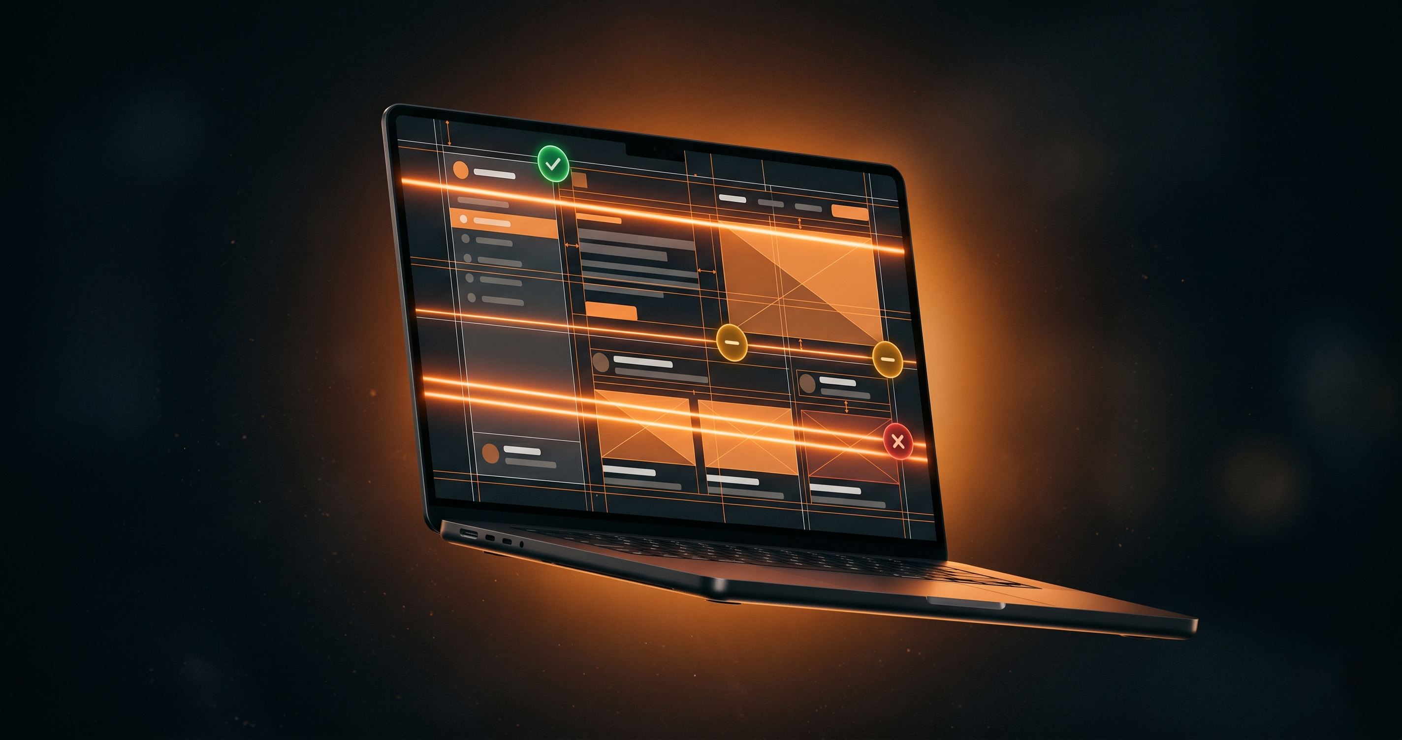
The UI Design Analyzer is a free browser-based tool at nitinmonga.in/tools/ui-analyzer that takes any UI screenshot — a website, a mobile app, a poster, a dashboard, anything — and scores it out of 100 across seven design criteria.
The seven criteria are color usage, spacing consistency, element alignment, visual hierarchy, typography contrast, design consistency, and corner radius consistency.
Each criterion gets its own score and its own feedback. The overall score is a weighted average that accounts for which criteria matter most depending on the type of design you are analyzing — a dashboard is not judged the same as a poster.
The whole analysis runs in your browser. Your image never leaves your device. No account. No login. No subscription. No watermark on the results. Completely free.
Why I built it instead of buying it
The existing tools in this space — Jobscan for resumes, Lighthouse for web performance — showed me the model worked. A tool that gives a specific, actionable number is more useful than a tool that gives general advice.
But for UI design specifically, I could not find anything that did what I wanted. The professional options were buried inside expensive design suites. The free options were vague. "Your design could be better" is not useful feedback. "Your spacing has a coefficient of variation of 0.68 — which means your gaps are inconsistent enough to break visual rhythm" is useful feedback.
I also noticed something over years of reviewing other designers' work. The issues that made designs feel off were almost always in the same small set of categories. Spacing inconsistency. Flat hierarchy where everything competes for the same amount of attention. Low color contrast that passes a quick visual check but fails an accessibility standard. Misaligned elements that sit close enough to an axis that you cannot consciously identify the problem but your eye registers it.
These are measurable things. Not subjective taste calls. Actual pixel-level data that a tool can calculate reliably.
That is what the analyzer does.
How the scoring actually works
I want to be transparent about the engine because I think it matters for how you use the tool.
The analyzer is not AI in the generative sense. It does not guess or hallucinate. It measures. Every score is backed by a calculation on the actual pixel data of your uploaded image.
Spacing is measured by detecting shapes and elements using OpenCV.js, then calculating the variance of gaps between them. Low variance means consistent spacing. High variance means inconsistency. The score reflects where on that spectrum your design sits.
Color usage is measured using ColorThief to extract the dominant palette, then calculating WCAG contrast ratios between color pairs. A main contrast ratio above 7:1 scores at the AAA level. Below 3:1 scores poorly because it will fail most accessibility audits.
Alignment is measured by detecting element edges and checking how many share an axis within an eight-pixel tolerance. A design where 80% of elements align to shared axes scores well. A design where everything is slightly off-grid scores poorly.
Visual hierarchy is measured by analyzing the size contrast between detected visual regions. A design with a clear focal element — one dominant thing the eye goes to first — scores better than a design where everything competes at the same visual weight.
Typography is measured by analyzing text region heights as a proxy for font size relationships. It cannot detect font names — that is a limitation I am transparent about in the tool. But it can tell you whether your headline and body text have enough size contrast to create a clear reading hierarchy.
Consistency is measured across spacing, radius, and color usage simultaneously. It flags when you are using three slightly different spacing values where one consistent value would do the same job more coherently.
Corner rounding is measured by sampling corner regions of detected shapes and checking whether the radius is consistent across elements. Consistent corner radius is one of the most frequently overlooked contributors to a polished, finished feeling in a UI.
The feedback for each criterion is deterministic — the same score always produces the same feedback. There is no randomness and no AI guessing. What you see is what the data says.
What the tool is not
I want to be specific about the limits because I think honesty about limits is what makes a tool trustworthy.
The analyzer cannot tell you whether your design is aesthetically beautiful. A design can score 90 out of 100 on measurable criteria and still be visually boring. A design can score 65 and still be directionally excellent but technically imprecise.
It cannot evaluate subjective taste. It cannot tell you whether your color palette evokes the right emotion for your brand. It cannot evaluate whether your illustration style is on-trend or your photography is compelling.
It also cannot analyze designs that are still in progress in Figma. It works on screenshots of finished or near-finished work — things that have actual rendered pixels to measure.
What it can do — and what I designed it to do — is catch the measurable problems. The spacing inconsistency you have been staring at and could not name. The alignment that is almost right. The contrast that passes your eye but fails WCAG AA. The hierarchy that is flat because everything is the same size.
Those are the problems that make a design feel off without a designer being able to say exactly why. And they are the problems the tool is built to find.
Who uses it and how
Since launching, the tool has been used by designers checking their own work before client delivery, developers doing a quick sanity check on a UI they built without a designer, students getting specific feedback on coursework, and freelancers validating a design before sending a proposal.
The most common pattern I see: someone uploads a design, gets a score in the 60s or 70s, reads the specific feedback, makes a targeted fix to the highest-impact issue, re-uploads, and watches the score move to the 80s. That feedback loop — upload, score, fix, re-upload — is the core workflow the tool is built for.
The score is not the destination. The specific feedback is. A score of 72 that comes with "spacing has a coefficient of variation of 0.71 — adopt an 8px spacing scale to reduce variance" is infinitely more useful than a score of 72 that just says "needs improvement."
How to use it
Go to nitinmonga.in/tools/ui-analyzer. Drop or upload any UI screenshot — JPG, PNG, or WebP up to 10MB. Select the mode that matches your design type (Web UI, Mobile, Poster, Dashboard, or Logo). Each mode applies different criteria weights because the standards for a poster are not the same as the standards for a dashboard.
The analysis runs in your browser. Results appear within a few seconds. The score card shows your overall score, your grade, and a breakdown of all seven criteria with individual scores and specific written feedback.
You can also generate a shareable PNG of your score card if you want to document the analysis or share it with a colleague or client.
No login at any point. No payment at any point. The tool is at the link above and it is free to use as many times as you need.
A note on why free matters here
I charge well for my design and development work. My rates are at the professional end of the market for what I do and where I am based.
The tools I build are free. Completely and permanently free. No trial period, no limited version with a premium upgrade, no watermark on exports.
The reason is straightforward. I built these tools to be useful. Tools that are useful but gated serve the tool maker, not the user. I would rather have a tool that 10,000 designers actually use and benefit from than a tool that 100 people pay for and that 9,900 people bounce off because of a signup wall.
If you use the UI Analyzer and it helps you deliver better work, that is the outcome I built it for. If that same interaction eventually leads to a project conversation or a referral, that is a nice side effect — but it is not the point.
The point is the tool working.
Try it at nitinmonga.in/tools/ui-analyzer. If you have feedback on the scoring, on what I should be measuring that I am not, or on anything that seems off — the contact page is open. I read everything.
Tagged
Nitin Monga
Graphic Designer, 3D Artist & Full-Stack Developer based in Punjab, India. 10+ years building websites, CGI ads, and digital platforms.