Creating a CGI Visual for “Patandar” by Arjan Dhillon
Some creative projects begin with a client brief. Some start with deadlines, meetings, and revisions. And then there are projects that begin simply because an idea refuses to leave your mind.
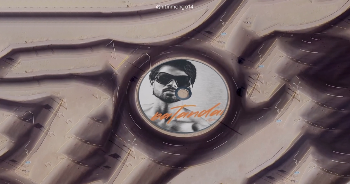
This CGI visual for Patandar by Arjan Dhillon was one of those projects.
No client request. No commercial purpose. No expectations.
Just a late creative thought — what if a Punjabi song visual could feel cinematic, immersive, and visually satisfying in a completely different way?
At that time, I had already been exploring 3D motion, Blender experiments, and satisfying miniature-style visuals. I was constantly testing ideas, trying to understand how realism, motion, and storytelling could work together inside short-form content.
Most fan edits online follow a familiar formula — fast cuts, overlays, transitions, typography, color effects, and trending editing styles.
There is absolutely nothing wrong with that approach.
But I wanted to create something that felt different.
Something that looked less like an edit and more like a visual experience.
That curiosity eventually turned into this CGI reel for Patandar — a fan-made visual that later crossed 404K+ views on Instagram and was even reposted by Arjan Dhillon himself on his Instagram story.
What started as a personal experiment unexpectedly became one of the most rewarding creative projects I have worked on.
The Starting Point
Whenever I listen to Punjabi music, I naturally start visualizing scenes in my head.
Sometimes it is typography.
Sometimes motion graphics.
And sometimes an entire visual world starts forming around the music.
While listening to Patandar, I kept thinking about movement, rhythm, and repetition.
The song had an energy that felt cinematic but also smooth at the same time.
I did not want to simply create another fan edit where clips transition one after another.
I wanted the visual itself to feel memorable.
Something that people would instantly stop scrolling for.
Something where the first second creates curiosity.
Something that makes viewers wonder:
“How was this made?”
That became the foundation of the entire project.
The Core Idea — Turning a CD into a Moving World
The initial concept came from a very simple object — a CD record.
Music has always been visually connected with CDs, vinyl records, circular motion, and spinning rhythm.
Instead of using the artwork as a flat image, I wanted to build an environment around it.
The thought process became:
What if the song artwork itself existed inside a miniature moving world?
That idea slowly evolved into a stylized circular road structure inspired by a CD record.
Rather than making it look overly futuristic or too complex, I wanted it to feel visually satisfying.
Something cinematic.
Something minimal.
Something that immediately catches attention without overwhelming the viewer.
The circular road structure helped naturally guide attention toward the center while also creating movement around the artwork.
That decision ended up becoming one of the strongest visual aspects of the reel.
Because when people watch short-form content, eye direction matters.
If viewers instantly understand where to look, retention improves naturally.
Without realizing it, the circular composition quietly helped hold attention.
The Goal Was Never Virality
Interestingly, virality was never the objective.
I was not thinking:
“This should get hundreds of thousands of views.”
I was thinking:
“Can I create something visually interesting enough that I personally enjoy watching?”
That mindset usually creates better work.
When you stop chasing performance and start focusing on craft, the final output often feels more authentic.
This project was entirely a fan-made creative experiment.
No monetization.
No promotion strategy.
No expectations from anyone.
Just pure experimentation.
And honestly, those kinds of projects often become the most memorable.
Because there is freedom.
You are not designing for approval.
You are designing for curiosity.
The Creative Workflow
Even though the final reel feels smooth and effortless, the actual process involved multiple layers of experimentation.
The entire project took approximately 4–5 hours from start to finish.
Which honestly feels short considering the amount of detailing involved.
But sometimes when the idea feels exciting, the workflow naturally becomes faster.
The process moved between After Effects and Blender, with each software playing a very specific role.
Step 1 — Understanding the Visual Direction
Before opening any software, I spent time understanding the overall visual mood.
This step is often ignored.
But personally, I think it matters more than technical execution.
The question I asked myself was simple:
What should this feel like?
Not just look like.
Feel like.
I wanted the visual to feel:
Cinematic
Satisfying
Smooth
Premium
Slightly unexpected
Scroll-stopping
At the same time, I did not want it to become overly dramatic.
Punjabi music visuals sometimes become too flashy with excessive effects.
That was something I wanted to avoid.
Instead, the goal was to create something visually strong but controlled.
Minimal movement.
Clean structure.
Balanced motion.
The kind of visual that people rewatch because it feels oddly satisfying.
Step 2 — Camera Tracking in After Effects
Once the idea became clear, the first technical step was 3D camera tracking inside After Effects.
This was probably the most important part of the entire workflow.
Whenever CGI elements are added to a moving scene, realism depends heavily on tracking accuracy.
If the camera movement feels even slightly off, the illusion immediately breaks.
And audiences notice it — even if subconsciously.
Good tracking feels invisible.
Bad tracking feels fake.
So getting this stage right mattered a lot.
The goal was to ensure that the CGI world felt naturally attached to the environment instead of appearing pasted on top.
This process involved carefully tracking movement and making sure perspective alignment felt believable.
Honestly, tracking accuracy became the biggest challenge during this project.
Small mismatches in motion can completely ruin realism.
There were moments where adjustments had to be refined repeatedly to ensure that everything felt locked naturally into place.
Because the audience may not understand why something feels fake.
But they instantly know when something feels wrong.
That is one of the hidden realities of CGI work.
Sometimes viewers only see a few seconds of content.
But behind those few seconds are dozens of tiny corrections that nobody notices.
And ironically, that invisibility usually means the work is successful.
Step 3 — Moving Into Blender
After the tracking setup was ready, the next stage moved into Blender.
This is where the visual world actually started taking shape.
The centerpiece of the reel was inspired by a CD record, transformed into a stylized circular environment.
Instead of building something overly detailed, I intentionally kept the composition focused.
One thing I have learned while experimenting with 3D visuals is this:
Complexity does not always create better visuals.
Sometimes simplicity creates stronger impact.
Especially in short-form content.
People are scrolling quickly.
The visual needs to communicate instantly.
That is why the environment stayed structured, clean, and visually organized.
The circular road system naturally wrapped around the center artwork while maintaining movement and balance.
At this stage, composition became extremely important.
Every angle mattered.
Every curve mattered.
Even spacing matters more than people realize.
In miniature-style CGI, small design decisions can dramatically affect how premium the final scene feels.
Lighting and Realism
One of the biggest reasons CGI visuals fail is lighting.
You can have good modeling.
Good camera work.
Good textures.
But if the lighting feels artificial, everything immediately looks fake.
So instead of making the scene overly bright or dramatic, I focused on keeping the lighting controlled and cinematic.
The intention was not photorealism.
The intention was believability.
There is a difference.
Sometimes visuals do not need to look perfectly real.
They just need to feel believable enough that viewers accept the illusion.
That subtle difference matters.
The camera movement, perspective, shadows, and visual balance all worked together to make the environment feel grounded.
Step 4 — Rendering and Composition
After the Blender scene was complete, the next phase involved rendering and bringing everything back into After Effects for final composition.
This stage is where the reel started feeling alive.
The movement became smoother.
Transitions became cleaner.
The entire visual started feeling connected.
Composition work involved refining:
Timing
Motion smoothness
Visual balance
Camera consistency
Overall cinematic feel
I wanted the reel to feel effortless.
Not over-edited.
Not chaotic.
Just immersive.
One thing I consciously avoided was overusing effects.
Sometimes editors add too many transitions because they feel every second needs stimulation.
Personally, I believe restraint often creates stronger visuals.
Especially when the concept itself is already visually interesting.
Why the First Few Seconds Matter
One thing social media has taught creators is this:
You only get a few seconds.
Sometimes even less.
People decide instantly whether they continue watching or keep scrolling.
So from the beginning, I knew the first moment of the reel needed to create curiosity.
The miniature world perspective played a huge role here.
At first glance, viewers do not immediately understand what they are seeing.
And that confusion becomes curiosity.
They pause.
They look closer.
And once people stop scrolling, retention naturally improves.
That psychological pause factor became one of the reasons this reel performed strongly.
The Unexpected Response
When I finally uploaded the reel, I genuinely did not expect anything major.
I liked how it turned out.
That already felt satisfying enough.
But then something interesting happened.
The reel started gaining momentum.
Views kept increasing.
Engagement started growing.
People were rewatching it, sharing it, and asking how it was created.
Eventually, the reel crossed 404K+ views on Instagram.
For a personal fan-made CGI experiment, that number felt genuinely rewarding.
Especially because there was no promotion behind it.
No campaign.
No marketing strategy.
Just organic reach.
And honestly, that is one of the best feelings as a creator.
When something performs because people genuinely enjoy it.
Not because it was forced into visibility.
The Moment That Felt Unreal
Out of everything that happened with this project, one moment stood out the most.
Arjan Dhillon reposted the reel on his Instagram story.
That moment honestly felt surreal.
As a fan creating something inspired by an artist’s work, seeing the artist themselves acknowledge it feels incredibly rewarding.
Especially when the project started as nothing more than an experimental creative idea.
It felt validating.
Not in a “numbers” way.
But in a creative way.
Because it reminded me that putting effort into experimentation matters.
Sometimes the things you build just for fun end up reaching places you never expected.
What This Project Taught Me
Every creative project teaches something.
And this one taught me quite a lot.
1. Personal Projects Matter
Not every meaningful project comes from clients.
Sometimes the work you create for yourself becomes the strongest representation of your creativity.
This reel reminded me that personal experiments deserve time too.
2. Simplicity Wins
The final visual was not technically overcomplicated.
It was focused.
Balanced.
Intentional.
Sometimes fewer elements create stronger impact.
3. Details Create Believability
Tracking accuracy became one of the hardest parts.
And it reminded me how important invisible details are.
People may not notice precise tracking.
But they definitely notice when something feels wrong.
4. Experimentation Leads to Growth
Without experimentation, creative work becomes repetitive.
Trying unfamiliar ideas — even without guarantees — often leads to the best outcomes.
This reel exists because of curiosity.
Nothing else.
Final Thoughts
Looking back, this project feels bigger than just a fan edit.
It became proof that creative curiosity is worth following.
What started as a simple thought —
“What if I build a CGI world around this song?”
turned into a visual experiment watched by 404K+ people, appreciated by audiences, and eventually reposted by Arjan Dhillon himself.
And the best part?
It was simply fun to make.
No pressure.
No deadlines.
Just creativity.
Sometimes, those are the projects that leave the biggest impact.
Tagged
Have a similar project?
Graphic Designer, 3D Artist & Full-Stack Developer based in Punjab, India. Let's build something great together.