CSK Meet & Greet 2025 Event Branding
Nitin Monga
Designer · Developer · 3D Artist
The Brief
When City Union Bank stepped up as the official credit card partner of Chennai Super Kings, the announcement could not be a press release. It needed to be a celebration. A room full of Chennai fans, three CSK superstars on stage, a live musical performance, and one yellow-soaked afternoon that felt like the city had walked into the venue with the team.
I was brought in to design the entire visual world of that afternoon — every printed surface, every LED frame, every standee, every backdrop. Stage to floor. Entry to exit. Camera to crowd. Nothing the audience would see was outside my brief.
The brief in one line: Bring Chennai's yellow into a banking partnership without losing either of them.
Why this project was different
Most banking sponsorships in cricket get treated like footnotes. A logo on a corner. A small mention in the speeches. The brand sits in the back while the team takes the spotlight. CUB and CSK wanted the opposite — a partnership that felt equal, where the bank's identity did not get swallowed by the team's mythology.
That meant the design had to do something harder than a normal cricket event. It had to make a financial brand feel as electric as Whistle Podu — without diluting either one.
My role
Complete event visual identity from concept to install
Main stage LED backdrop design with player-talk and musical-performance variants
Side standees, photo-op wall, stage skirting, ramp branding, console box wraps
LED screen graphics across multiple segments — welcome, performer intro, player chat, audience moments
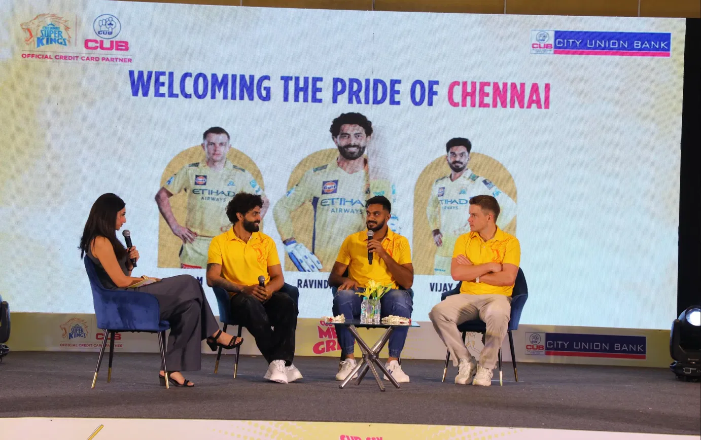
Player feature key visual "Super Chat With CSK Superstars" featuring Sam Curran, Ravindra Jadeja, Vijay Shankar
Cue cards, table tents, audience-facing print collateral
Production-ready file delivery, fabricator coordination, on-site verification
The Challenge
Two icons. Both demand the room.
Chennai Super Kings live in fierce yellow — the color of a sunrise over Chepauk, the color of every Tamil Nadu home jersey for the last decade. Yellow is non-negotiable. City Union Bank lives in hot pink (#EC1E78) and navy blue (#1E40AF) — a credit card brand built since 1904, equally protective of its identity. Putting them on the same wall could easily produce a clash that helped neither one.
I needed a system where yellow stayed the dominant emotional color (because this was a fan event, not a banking conference) but where the pink and blue stayed visible enough that CUB felt like an equal partner, not a sponsor logo in the corner.
A multi-format stage
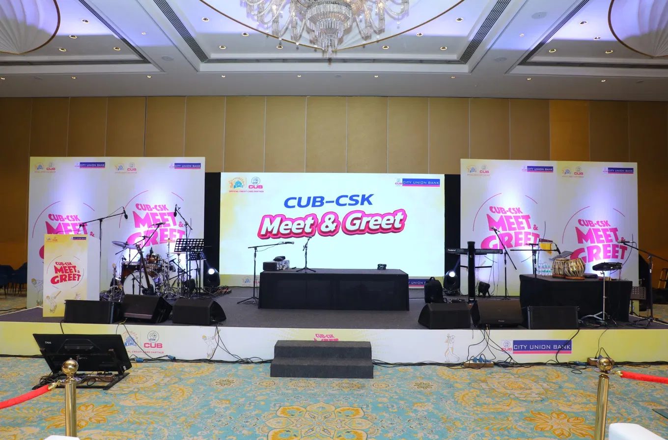
The event had three distinct on-stage moments: a live musical performance by Karthik with his band, a celebrity-host-led chat with the players, and a group photo moment with the audience. Each segment needed its own LED backdrop. Each backdrop had to be on-brand. Each transition had to be quick enough that the audience never felt the program drop.
Camera-readiness above everything
Every photo from this event would end up on CSK's social channels and CUB's marketing collateral for the next twelve months. The backdrops would be cropped, zoomed, repurposed, screenshotted. I had to design each piece knowing it would not just live in the moment — it would live online for a year.
Constraints I worked inside
Two demanding brand identities — yellow had to dominate emotionally without burying pink and blue. Solved with a soft watercolor base instead of solid yellow walls.
Multiple stage segments — three different LED backdrops, plus standee variants, plus skirting, all visually connected as one event.
Camera-first repurposing — I designed each backdrop knowing it would be cropped in social posts later. Negative space was sized to where heads and microphones would sit.
High-profile cricket talent — Sam Curran, Ravindra Jadeja, and Vijay Shankar appear in the key visual. Their imagery had to feel premium, not pasted in.
Live event window — files had to be fabrication-ready with zero revision room. One installation pass on event day.
The Process
Step 1 — Deciding what "yellow" really meant
Before designing anything, I ran experiments with how yellow should appear in the room. A flat yellow wall felt cheap. A solid CSK yellow LED looked like an oversaturated TV studio. Photography against pure yellow made everyone's skin look jaundiced under venue lighting.
The breakthrough came from cricket itself — specifically the late afternoon stadium sun. That yellow is not flat. It is dusty, hazy, scattered through clouds and floodlights. I translated that observation into a soft watercolor yellow base that washed across every surface. CSK yellow stayed the soul of the design, but it became atmospheric rather than aggressive. Skin tones photographed beautifully against it. The pink and blue CUB accents popped without fighting.
Step 2 — Naming the moments visually
I broke the event into named visual chapters so every transition would feel intentional, not chaotic:
Welcome state — the room before the program starts
Karthik performance state — "Mesmerising Musical Performance" LED backdrop
Player entrance — "Welcoming The Pride Of Chennai" with player imagery
Super Chat — the host-led conversation segment with Sam Curran, Ravindra Jadeja, Vijay Shankar
Group photo — the partnership commemoration moment with all guests
Each state got its own LED file. Each one was visually different enough to feel like a new chapter, but recognizable enough that the audience knew they were still in the same event.
Step 3 — The typography choice
I picked a chunky, slightly retro display typeface for "Meet & Greet" — the kind of lettering you might see on a vintage cricket poster from the 1980s. Pink with a subtle white outline, set against the watercolor yellow. It became the signature mark of the event. The same typography carried across every standee, every entry-level print, every cue card.
Supporting copy was set in a clean sans-serif so the playful display lettering had room to breathe. Player names appeared in bold uppercase with letter-spacing tight enough to feel official.
Step 4 — The illustrated cricket characters
I drew two illustrated cricket figures — a batsman in mid-shot and a fielder catching the ball — that became the visual mascots for the event. Light contour line work in yellow with subtle pink details. They appeared in every standee corner, on the bottom of the photo-op backdrop, and across the skirting that ran along the stage front.
Illustration over photography was a deliberate call. Player photos already lived on the big LED. Illustrated figures on the printed pieces gave the event a softer, more inviting visual register — less press conference, more family afternoon.
Step 5 — The "Super Chat" key visual
The single most important graphic in the event was the player feature key visual: "Super Chat With CSK Superstars" — Sam Curran on the left, Ravindra Jadeja center with bat, Vijay Shankar on the right. This composition needed to look as polished as a CSK official poster while still feeling like part of my event branding system.
I placed each player inside a soft arched yellow shape — a callback to stadium turnstiles and gateway architecture — against the watercolor yellow background. The header used CUB's navy blue for "Super Chat With" and switched to hot pink for "CSK Superstars" — the partnership lockup baked into the headline itself.
Step 6 — Multi-surface coherence
Once the key visual was locked, every other surface fell in line. The vertical side standees carried the "CUB-CSK Meet & Greet" wordmark in pink with the cricket illustrations at the foot. The photo-op wall amplified the same wordmark large. The stage skirting carried a repeating cricket-character pattern in yellow watercolor. The console boxes and ramp signage stayed minimal — just the partnership lockup — because they sat in the visual periphery during the program.
Step 7 — Production handoff
Every file went out with explicit bleed marks, color profiles, and dimension calls against the fabricator's exact specifications. The LED backdrop graphics were prepped at native pixel pitch. The standees were built as scaled vector files at print resolution. Skirting graphics were tiled correctly for the seamless length needed.
On install day, the only thing that needed adjustment was the height of a couple of microphone stands. The visual identity walked in fully formed.
What I Designed
Main LED Backdrop (multi-state) — the hero stage element with multiple content states: Welcome, Karthik performance, Super Chat with players, Pride of Chennai welcome
Side Standees (pair) — vertical signage flanking the stage. CUB-CSK wordmark, cricket illustrations, partnership lockup. Camera-ready at both wide and close shots.
Photo-op Backdrop — standalone wall for fan and media photos. Large "Meet & Greet" wordmark with full cricket illustration system.
Super Chat Key Visual — the player feature graphic. Sam Curran, Ravindra Jadeja, Vijay Shankar in arched yellow frames against watercolor yellow. Designed to also work as a social poster post-event.
Pride Of Chennai Welcome Visual — the player introduction LED frame welcoming the three superstars to the stage.
Stage Skirting — front-of-stage panels carrying the cricket-illustration pattern and partnership branding at audience eye level.
Ramp & Console Box Branding — side-of-stage elements visible in every wide camera shot. Minimal partnership lockup.
Karthik Performance Visual — custom LED backdrop introducing the musical performer with portrait, name typography, and event partnership lockup.
Reception & Entry Signage — first-impression standees as guests entered the venue. Set the visual tone before the program began.
Cue Cards & Table Pieces — host-facing print pieces with the same brand voice. Readable in low light, on-brand from every camera angle.
The Result
When the doors opened, the room felt the way I had hoped — yellow but not loud, premium but not corporate, cricket but not cliched. The watercolor yellow caught the venue's warm overhead lighting and pushed it back into the room as a soft glow. Pink and blue accents stayed visible on every camera angle. The illustrated batsman and fielder appeared on enough surfaces to feel like silent characters watching over the event.
Ravindra Jadeja, Vijay Shankar, and Sam Curran took the stage against the Super Chat LED backdrop. The yellow arches behind them framed their interview perfectly — every photo that came out of the segment looked like it belonged in a CSK matchday album. The Karthik performance segment transitioned cleanly with its own dedicated visual. The group photo at the end captured the entire delegation against a yellow-warm LED wall that read clearly even at the back of the room.
What carried the room: The yellow stopped being a color and became the temperature of the afternoon.
Where it lives now
In the months after the event, the photos circulated across CSK's official social channels, CUB's partnership marketing, and the Tamil sports press. The Super Chat key visual got cropped for Instagram posts, story templates, and even reused for follow-up promotional creative. A piece of branding designed for one afternoon ended up earning a full media life cycle.
Behind the Craft
Why I picked watercolor yellow
A solid yellow LED wall would have over-saturated the cameras and made every player's jersey lose contrast. Watercolor yellow gives a slight tonal variation across the surface — lighter in the center, deeper at the corners — which lets photography composition breathe. It also nods to traditional sports poster design, where wash backgrounds were the norm before everything went flat-color in the 2010s.
Why the typography felt slightly retro
The chunky pink lettering for "Meet & Greet" was a deliberate departure from modern minimal sans-serifs. Cricket has a heritage — the painted boundary boards, the hand-lettered scoreboards of older grounds, the vintage Test Match posters. I wanted the typography to feel like it could have been hand-painted on a Chepauk wall in 1985. That nostalgia gave the event a personality no Helvetica wordmark could deliver.
Why pink and blue lived side by side
CUB's identity uses both navy blue and hot pink. Putting only one of them next to CSK yellow would have felt off-balance. By using "Super Chat With" in navy and "CSK Superstars" in pink within the same headline, I kept both CUB brand colors visible while turning the partnership itself into typographic art. The headline became the brand handshake.
Why I illustrated instead of photographed cricket figures
Photography would have introduced specific players — which would have either over-promised who was attending or visually competed with the actual players on stage. Illustration kept the secondary cricket imagery generic and inviting. The illustrated batsman and fielder belong to no specific player, which let Jadeja, Shankar, and Curran own the live moment without visual interference.
Why every surface used the same five elements
Across every printed and digital piece, the same five components appeared: CSK lion logo, CUB logo, partnership lockup ribbon, "Meet & Greet" wordmark, cricket illustration character. Repetition is what makes event branding feel like a system, not a series of one-off designs. By the end of the afternoon, the audience could recognize the event identity from across the room.
Final Thoughts
Yellow is not a color in Chennai. It is a feeling. I just had to design around it.
Cricket event branding is one of the few disciplines where you have to design with the city in mind, not just the brand. CSK's yellow does not belong to a marketing department — it belongs to Chennai. My job was to honor that yellow while making space for a banking partner to stand inside it as an equal.
The CSK × CUB Meet & Greet 2025 was the kind of project I love most — where design has to hold up under stage lighting, in front of a fan crowd, on three superstars' shoulders, and across a year of social media reposts. Yellow held. Pink held. Blue held. The event held them all together.
// Gallery
Tagged
Have a similar project?
Graphic Designer, 3D Artist & Full-Stack Developer based in Punjab, India. Let's build something great together.