From WordPress to Next.js in 27 Days: The Nova Support Services Story
How an Instagram message turned into a complete website rebuild for an Australian NDIS provider
It started with a message on Instagram.
Not a long one. Not a formal brief with a PDF attached. Just a short message from someone named Sharon Jyot, introducing herself as the founder of Nova Support Services, an NDIS registered provider based in Australia. She had seen some of my work, liked what she saw, and wanted to know if I could help rebuild her website.
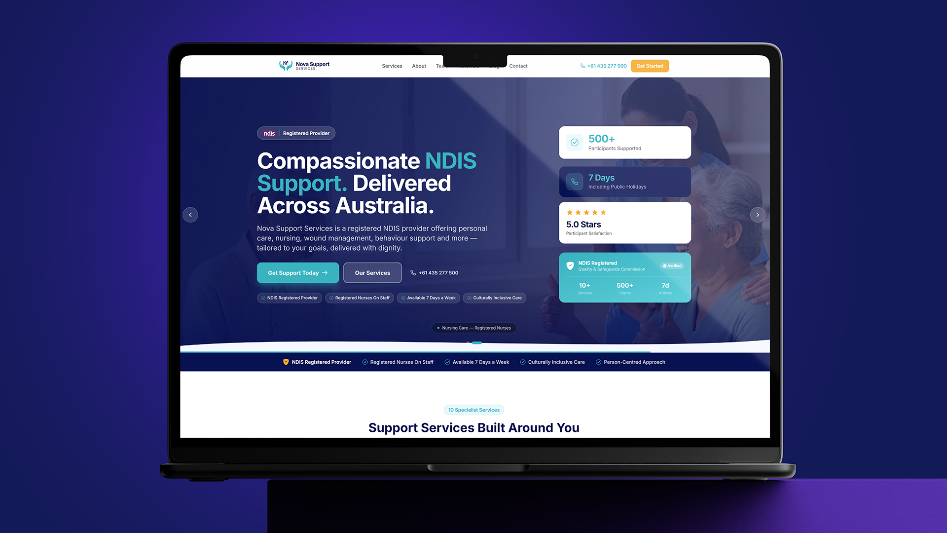
The existing site was on WordPress. It worked, technically. It had information on it, it had a contact form, it had the services listed. But Sharon felt it did not represent where her business actually was. Nova Support Services delivers personal care, nursing, wound care, behaviour support and disability services to people across Australia who rely on the NDIS, the National Disability Insurance Scheme, for support. This is not a business where the website is decorative. For many families, the website is the first and sometimes only impression of whether a provider can be trusted with someone they love.
Sharon wanted the site to feel like that trust. Clean, fast, modern, easy to navigate for people who might be stressed, tired, or searching for help at midnight because that is when they finally had a quiet moment to look.
She also told me something that mattered a lot to how I approached the entire project. She needed the new site live within a month. Not because of a marketing campaign or a launch event, but because her current site was costing her in ways that were quietly adding up. Slow load times. Limited flexibility. A WordPress setup that needed constant small fixes. She wanted to stop thinking about the website and start thinking about her clients again.
I told her one month was tight but doable, and I meant it. What I did not tell her right away was that I had already started thinking about the architecture before our second conversation even ended.
The first call: more than a brief, a relationship
Most projects start with a brief document. This one started with a conversation that felt more like getting to know a person than getting to know a client.
Sharon walked me through her business in detail. Not just the services on a list, but how each service actually worked in practice. Personal care looks different for a young adult living independently than it does for an elderly client with complex needs. Nursing support has different compliance requirements than behaviour support. Wound care has its own clinical considerations that needed to be communicated clearly but never in a way that felt cold or clinical to a reader who might be a worried parent or carer.
She gave me her brand colours, her existing logo, her tone of voice preferences, examples of competitor sites she liked and disliked, and a long list of the specific services that needed individual pages rather than being bundled together. She also mentioned that a large part of how new clients found her was through Google Ads, and that the landing pages those ads pointed to needed to convert well, not just look nice.
By the end of that first proper conversation, I had a much clearer picture than any brief document could have given me. I also had something else: a sense of how much this business meant to her. Nova Support Services was not a side project or an investment vehicle. It was something Sharon had built carefully, and the website needed to carry that same care.
Choosing the stack: why Next.js made sense here
WordPress is not a bad platform. For a huge number of businesses it is exactly right. But for Nova Support Services, a few things pointed clearly toward a rebuild on Next.js.
Speed was the first reason. NDIS providers compete heavily on Google Ads, and page load speed directly affects both ad quality scores and conversion rates. A slow landing page means a more expensive click and a visitor who leaves before the page even finishes loading.
Flexibility was the second reason. Sharon had ten distinct services that each needed their own dedicated page, written with care, optimised individually for search, and structured in a way that made sense for someone scanning quickly on a phone. On top of that, she needed four separate landing pages built specifically for different Google Ads campaigns, each with slightly different messaging depending on which service or region the ad was targeting.
The third reason was the intake process. Nova Support Services needed a way for potential clients, or their family members, to submit detailed information through the website rather than just sending a generic enquiry. This meant a multi step intake form that did not feel overwhelming, that saved progress sensibly, and that sent the right information to the right place the moment it was submitted.
Given all of this, I settled on a stack of Next.js 14 for the frontend and routing, MySQL with Prisma for the database layer handling enquiries and intake submissions, and Tailwind CSS for styling. For animation, I used GSAP, carefully, only where it added something rather than just for the sake of motion. For the intake form and contact notifications, I used the Resend API to handle transactional email reliably. For hosting, the site went onto a VPS managed through CloudPanel on Hostinger, which gave Sharon full control without the overhead of more complex infrastructure.
None of these choices were exotic. They were chosen because each one solved a specific problem Sharon had described to me, not because they were trendy.
Building the site: ten services, four landing pages, one story
The first week was mostly structural. Before writing a single line of page content, I mapped out the full site architecture. Ten service pages, each with its own URL, its own metadata, and its own internal linking strategy so that someone landing on the wound care page could naturally find their way to personal care or nursing support if that was actually what they needed.
For each service page, the goal was the same: explain clearly what the service involves, who it is for, how Nova Support Services delivers it, and make it effortless to take the next step, whether that was filling in the intake form or picking up the phone. The writing had to walk a careful line. Professional enough to reassure someone that this was a properly registered, qualified provider, but warm enough that a tired parent reading it at eleven at night would feel like they were talking to a person, not a brochure.
The four Google Ads landing pages were a different challenge entirely. These pages needed to be fast, focused, and almost ruthless in how they guided a visitor toward one single action. No wandering navigation, no distractions, just a clear path from "I clicked an ad because I need help" to "I have submitted my details and someone will call me." Each landing page was built around a specific campaign angle Sharon was running, which meant slightly different headlines, slightly different emphasis, but the same underlying trust signals throughout.
The multi step intake form took the most careful thought of anything on the site. NDIS related enquiries often involve sensitive information, and the form needed to feel safe and unhurried. I broke it into logical steps rather than one long page, with progress clearly shown, so that someone filling it in on their phone while sitting in a hospital waiting room would not feel like they were filling out paperwork all over again. Each completed step saved its data, so nothing was lost if someone needed to pause and come back.
For the visual side, GSAP and ScrollTrigger were used sparingly. A gentle fade and slight upward movement as sections came into view, smooth transitions between service categories, and subtle hover states on cards. Nothing flashy. The goal was for the site to feel calm and considered, the same way you would want a person helping you to feel calm and considered.
For performance, the site was built with Incremental Static Regeneration in mind from the start. The service pages and landing pages did not need to update every minute, but they did need to be fast for every single visitor, especially those clicking through from paid ads on patchy mobile connections. ISR meant pages were served as static, lightning fast HTML, while still allowing Sharon to update content without needing a full redeploy every time.
The 27 day countdown
I had promised Sharon the site would be live within a month. I did not want to deliver it on day 29 with everything rushed in the final stretch. So from the very start, I worked backward from the deadline and built in buffer time for review and feedback, because I knew Sharon would have thoughts on the copy, the imagery, and the flow once she could actually click through a real site rather than imagine one from a brief.
The first ten days went into architecture, the database schema for enquiries and intake submissions, the design system, and the first few service pages so Sharon could see the direction early and tell me if anything felt off before it was replicated across ten more pages.
The next stretch was the bulk of the build. Service pages, landing pages, the intake form, email notifications through Resend, and the core animations. This was the heaviest part of the timeline, and it was also the part where Sharon's earlier detailed briefing paid off the most. Because she had given me so much clarity at the start about how each service actually worked, I rarely needed to stop and ask basic questions. The questions that did come up were the right kind, refining details rather than rebuilding sections.
The final days were for deployment, testing every form submission end to end, checking every page on mobile, tablet, and desktop, verifying that emails arrived correctly formatted, and making sure the new site was properly set up for search engines from day one with correct metadata, sitemaps, and redirects from the old WordPress URLs so that none of Sharon's existing search rankings were lost in the transition.
The site went live on day 27.
What Sharon said when she saw it live
There is a particular kind of message you hope to get at the end of a project like this, and Sharon sent it. Not a long message. Just genuine excitement at seeing her business represented the way she had always pictured it, fast, clean, and finally matching the quality of care she puts into her actual work with clients.
What stayed with me most was not the relief of hitting the deadline, although that mattered too. It was that Sharon's trust at the very start, the way she opened up about her business in that first conversation, made every decision afterward easier. When a client gives you that much honesty about what their business actually needs, the technical choices almost make themselves. The hard part is never really the code. It is understanding what someone is trying to build, and why it matters to them.
Nova Support Services is live now at novasupportservices.com.au, running on Next.js, faster than it has ever been, with ten service pages, four dedicated landing pages for Google Ads, and an intake process designed for people who are often reaching out during one of the harder moments of their day.
For me, this project was a reminder of something I try to keep at the centre of every build. A website for an NDIS provider is not just a website. For someone searching for support for a parent, a child, or themselves, it might be the first door they knock on. Making sure that door opens smoothly, quickly, and with a sense of care, that is the actual work.
Twenty seven days. One Instagram message. A founder who cared enough to explain everything properly. And a site that, hopefully, makes someone's hardest day just a little bit easier.
Have a similar project?
Graphic Designer, 3D Artist & Full-Stack Developer based in Punjab, India. Let's build something great together.