When the Event Becomes the Brand — New Year Grandeur 2022–23
Nitin Monga
Designer · Developer · 3D Artist
The Brief
New Year Grandeur was not just a party. It was a four-day food, fashion, and music festival running from 29th December 2022 to 1st January 2023 at Grand Bazaar — one of the most high-footfall venues in the city during the holiday season. The client, Oopré Overground in association with Group G, had assembled an impressive line-up: MasterChef finalist Smrutisree Singh heading the food carnival, Sufinama The Band bringing Sufi and rock from Delhi, singer Shreya Jain, rapper Pratvaj Mishra, fashion fiesta performances, dance groups, and celebrity guests including Shrutiksha Nayak — Femina Miss India Odisha 2018 semi-finalist.
With this much happening across four days, the branding had one job: make the event feel like a destination before people even arrived. The print collateral needed to work on walls, in malls, in people's hands, and at the venue entrance — all at the same time, all telling the same story.
I was brought in to design every piece of print collateral for the event. Standees. Flyers. Danglers. Invitations. The entry box. Every printed surface that a visitor, attendee, or passerby would encounter from the moment promotion began to the moment they walked through the door.
The brief in one line: Make this event feel unmissable before it starts — across every format, every surface, every audience.
My role
Full print collateral system design — concept to print-ready files
Multiple standee variants (6'×3') for different performers and sponsors
A4 flyers for distribution across the city
12"×12" circular danglers for in-venue and mall placement
8"×5" invitation cards — personalised variants for different recipient groups
4'×4' entry box for venue entrance — all four sides designed
Brand consistency system tying all formats together
The Challenge
One event. Multiple audiences. Multiple formats.
New Year Grandeur had layers of complexity that a simpler event would not. It ran for four days with different headliners on different days. It had multiple co-brands and associations — Oopré Overground, Group G, RAO, Ballantine's, and various sponsors. It had celebrity attendees alongside food, fashion, and music programming happening simultaneously. And it needed to reach three completely different audiences at the same time: general public (free entry, high footfall), corporate invitees (personalised invitations to clubs and companies), and media and industry guests.
Each of these audiences needed a slightly different communication. The standees in the mall needed to shout. The invitations needed to feel elegant and personal. The entry box needed to be directional and functional. The flyers needed to carry the full programme information without feeling like a cluttered leaflet.
All of these pieces had to feel like they came from the same event — the same visual world — despite serving completely different purposes and reaching completely different people.
The colour system problem
The event name — New Year Grandeur — set a tone expectation immediately. Grandeur. That word implies luxury, warmth, occasion. It cannot be rendered in neon or flat corporate colours without losing the promise in the name itself.
At the same time, the event had to communicate energy. Live music. Fashion shows. Food carnival. Four days of activity. A passive beige palette would kill the feel.
I needed a system that carried warmth and luxury while still having enough visual energy to compete with all the other December event promotions in the city. The answer was a cream and gold foundation with dark mahogany-red script accents — warm, rich, festive, and distinctly premium without going the overused red-and-gold Diwali route.
Volume of variants
This was not a single design problem. It was a system problem. The standees alone needed multiple variants — one featuring Shrutiksha Nayak for the main event promotion, one for Sonu Nigam concert passes, one for Smrutisree Singh's food carnival, one for the Look Salon beauty partner, one for the ADDA Cafe New Year Eve Bash. Each variant needed to carry the same visual DNA while featuring completely different content, different personalities, and different calls to action.
Multiply that across five formats (standees, flyers, danglers, invitations, entry box) and you have a design system problem, not just a layout problem. Every piece needed to be self-contained and functional alone — but when placed together across the venue, they had to feel like one coherent identity.
The Process
Step 1 — Establishing the visual language
Before touching any individual format, I established the visual language that would govern all of them.
The background: a warm cream (#F5E6C8 range) with a subtle bokeh/glow texture. Not flat, not photographic. The glow texture gave every piece a sense of festivity and occasion without resorting to glitter or confetti clichés that would look cheap in print.
The typography system had three distinct layers working together. The display script — a flowing calligraphic typeface for "New Year Grandeur" — carried the premium feel and became the hero element recognisable across every format. Bold sans-serif handled all functional information (dates, times, venue, names) with strong hierarchy. A refined serif handled body copy and formal content in the invitations.
The colour palette: cream base, dark mahogany-red for the script display text, deep navy-black for strong informational callouts, gold-brown for accents and dividers. The "Free Entry For All" roundel became a recurring badge across every format — a high-impact, high-contrast element that communicated the biggest selling point of the event in a consistent visual device.
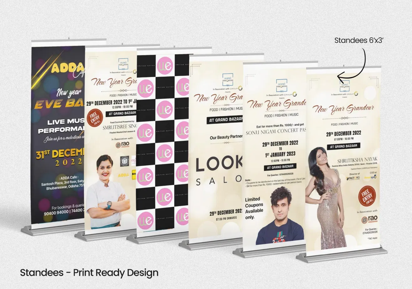
Step 2 — The standees (6'×3')
The standees were the largest outdoor touchpoints — placed in malls, at venue entrances, and across the city's commercial areas. At 6 feet tall and 3 feet wide, they had to read from 15 feet away in a busy environment.
Each variant followed the same structural hierarchy: partner logos at top, event name display script centre-upper, programme details and dates in the middle zone, and personality images or sponsor callouts in the lower half. The structural consistency meant that even when the content changed completely from standee to standee, a viewer who saw one would immediately recognise the next.
The Shrutiksha Nayak variant was the most refined — her full-length figure in a gold evening gown against the cream background created a natural luxury fashion-magazine quality. The Smrutisree Singh food carnival variant shifted register slightly — more energetic, warmer, food-focused — while staying within the same palette and typography system.
The ADDA Cafe New Year Eve Bash standee was the most distinct — a dark navy background with bokeh lighting for a nightclub atmosphere. Even here, the same structural principles applied, keeping it identifiable as part of the same family while serving a completely different venue's needs.
Step 3 — The A4 flyers
Flyers have one advantage over standees: they get into people's hands. They travel. They sit on cafe counters. They get passed between friends. They have a longer dwell time than a standee glanced at in passing.
The A4 flyer carried the most information of any format — the full performer lineup across all four days (Smrutisree Singh, Sufinama The Band, Shreya Jain, Pratvaj Mishra, Prince Dance Group), the daily timings, the Sonu Nigam concert pass offer details, the note about coupons, and all the contact information.
The design challenge was fitting all of this without the flyer looking like a printed spreadsheet. The solution was a clear section hierarchy — the event identity block at top, the featured performer with large photographic treatment in the middle, the programme details in a structured but unfussy layout below, and the fine print and contact in a compact footer. White space was used generously between sections to let each block breathe even on a dense information piece.
Multiple flyer variants were produced for different day-specific performers — each with the same layout but a different personality in the hero image zone.
Step 4 — The 12"×12" danglers
Danglers are one of the most underestimated print formats in Indian event marketing. A 12-inch circular piece hanging from a mall ceiling or venue rafter gets seen from below — which means it needs to be readable upside down, from an angle, and at distance simultaneously.
The circular format for the Oopré Overground dangler was deliberately simple. Brand mark centred on a clean white circle with a clean border. Nothing else. In a venue full of promotional noise, the restrained dangler read as the most premium piece in the space precisely because it did not try to communicate everything at once. It was a brand presence, not an information delivery device.
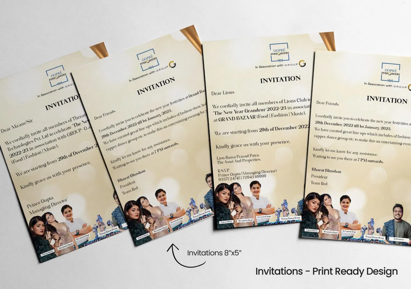
Step 5 — The invitations (8"×5")
The invitations were the most personal format in the system and required the most nuanced approach. The same event needed to be invited to three completely different recipient groups — corporate partners (addressing Managing Directors and company representatives), club members (Lions Club, addressed formally by organisation name), and general friends (informal warm tone).
Each invitation variant carried personalised salutation and opening copy while maintaining identical visual treatment — same cream background, same Oopré Overground header, same "INVITATION" bold heading, same footer with performer cutout images across the bottom strip. The performer strip at the bottom (Pratvaj Mishra, Shrutiksha Nayak, Smrutisree Singh, Prince Dance Group, Sufinama) served as a quality signal — showing the recipient the calibre of the lineup in a single glance.
The gold envelope treatment sealed the premium positioning. The physical unboxing experience of receiving an invitation — the envelope, the cream card, the structured layout — communicated that this was not a mass-printed flyer shoved into a mailbox. It was an invitation worth keeping.
Step 6 — The entry box (4'×4')
The entry box was the most unusual format in the project and the most interesting design problem. A 4×4 foot cubic box placed at the venue entrance, all four sides visible as attendees approached from any direction. Its purpose was dual: directional wayfinding ("THIS WAY" with a large arrow) and event branding.
The design solution treated all four faces as a continuous surface even though they were physically separate panels. The event identity — "New Year Grandeur (2022–2023)" with the full date, time, and venue information — repeated on all four faces so that no matter which side a visitor approached from, they received the same complete information. The large "THIS WAY →" treatment in high-contrast black on the cream background was sized for instant readability from 30+ feet. The cream background with the same bokeh glow treatment tied the box back to the rest of the collateral system even though its function was entirely different from a standee or flyer.
What made the entry box genuinely useful as a branding piece was the decision to make it the same visual warmth as the promotional materials. Venue entry boxes are usually bare cardboard or cheaply printed generic arrows. This one felt like it belonged to the event — like the event itself had extended its identity all the way to the door.
Step 7 — Print-ready delivery
Every format was delivered as print-ready files: correct bleed marks, CMYK colour profiles, embedded fonts or outlined text, and dimensions confirmed against the print vendor's specifications. Large format pieces (standees, entry box) were prepared at the correct resolution for the substrate. The invitations were prepared at 300 DPI for offset printing. The flyers were prepared for both digital distribution and print.
When the team received the files, nothing needed to go back and forth on technical corrections. The design arrived ready to print.
What I Designed
Standees (6'×3') — 5 variants — Shrutiksha Nayak main event variant, Smrutisree Singh food carnival variant, Sonu Nigam concert pass variant, Look Salon beauty partner variant, ADDA Cafe New Year Eve Bash variant
A4 Flyers — multiple performer variants — Sufinama The Band, Shreya Jain, and combined programme variants with full lineup and daily schedule
12"×12" Circular Danglers — Oopré Overground brand dangler for in-venue and mall ceiling placement
8"×5" Invitations — 4 personalised variants — Corporate (company/MD addressing), Lions Club (formal addressing), general friends (informal warm addressing), performer-specific variant
4'×4' Entry Box — all 4 sides — Directional wayfinding with full event identity, "THIS WAY" treatment, complete event details repeated across all faces
All files delivered print-ready: bleed marks, CMYK profiles, correct resolution per substrate, outlined text, vendor-spec dimensions.
The Result
New Year Grandeur ran for four days across the holiday season at Grand Bazaar with free entry for all. The collateral system worked across every touchpoint — standees in malls pulling foot traffic in, flyers in people's hands carrying the full programme, invitations arriving in offices and homes ahead of the event, danglers creating ambient brand presence inside the venue, and the entry box being the final piece of the experience before someone walked in.
The visual consistency across all formats meant that someone who saw a standee in a mall on December 20th and then received an invitation on December 24th immediately recognised they were the same event. That recognisability — built through a consistent visual language across five different formats — is what transforms scattered print collateral into a coherent brand experience.
What the project proved: Event branding is not about making five nice designs. It is about making one visual world that lives on five different objects simultaneously.
Behind the Craft
Why cream and not white
Pure white in print looks clinical. It also shows dirt, fingerprints, and edge wear immediately on physical collateral that gets handled and displayed over several weeks. The warm cream base gave every piece a softer, more premium feel while being more forgiving as a physical object. It also made the photography — particularly the cut-out celebrity and performer images — pop more naturally than a cold white background would have.
Why the script typeface for the event name
"New Year Grandeur" needed to look like it cost something. Script typefaces carry inherent associations with celebration, luxury, and occasion — a formal wedding invitation, a champagne label, a hotel stationery. Using a script for the event name and bold sans-serif for all information created a clear emotional register: the name was a feeling, the information was a fact. Neither competed with the other.
Why the performer images ran across the invitation footer
The bottom strip of performance cutouts on the invitations served a specific psychological purpose. A recipient who did not know any of these names could see the quantity and variety — six different artists and groups — and understand this was a serious, well-produced event. A recipient who did recognise Smrutisree Singh from MasterChef or Shrutiksha Nayak from Femina Miss India immediately had a credibility anchor. The strip did not require reading. It communicated quality at a glance.
Why the entry box repeated the same content on all four sides
A different designer might have put different content on each face of the box — artist of the day on one side, sponsors on another, schedule on another. I chose to repeat the same core information on all four faces because the box's primary job was wayfinding, not content delivery. The viewer approaching the box from any direction needed to immediately understand: this is the event, this is when, this is where, go this way. Fragmented information across four faces would have required the viewer to walk around the box to get a complete picture — which defeats the purpose of an entrance installation entirely.
Why each standee variant maintained the same structural skeleton
With five different standees for different purposes and personalities, the temptation was to let each one be its own unique design. I resisted this. The structural skeleton — logo band top, event name display mid-upper, information zone centre, personality or content zone lower — stayed constant across all variants. The result was that even the ADDA Cafe dark-background variant, which looks visually very different from the cream Shrutiksha Nayak standee, still reads as part of the same family when placed alongside it. Systems thinking over individual design thinking.
Final Thoughts
Print is the most physical form of design. It has weight. It has texture. It exists in a real space with real light. Designing for print means designing for the world, not the screen.
New Year Grandeur gave me a format problem I genuinely love — how do you maintain a single visual identity across objects as different as a 6-foot standee and a hand-held invitation card? The answer is always the same: establish the language first, then apply it. The cream base, the script display, the mahogany-red accent, the gold dividers, the performer strip — these five elements appeared on every format and made every format recognisably the same event.
When a visitor walked into Grand Bazaar on 29th December 2022, they had already seen this visual world on a mall standee, held it in their hand as a flyer, received it at their office as an invitation, and walked past it on a box at the entrance. By the time they arrived, the event had already begun.
// Gallery
Tagged
Have a similar project?
Graphic Designer, 3D Artist & Full-Stack Developer based in Punjab, India. Let's build something great together.