6 Best Logo Fonts to Download Free in 2026
If you've ever stared at a blank canvas trying to name-drop your brand into something memorable, you already know the truth: your logo font does 80% of the talking before anyone reads a single word of your tagline. A great logo font doesn't just spell out a name — it tells people whether your brand is playful or serious, modern or classic, approachable or premium, all in the space of a few letterforms.
Nitin Monga
Designer · Developer · 3D Artist
That's exactly why this roundup exists. We've curated six standout logo fonts — Ragonte, Outflag, Gestavo, Qufina, Gorphy, and Rosefana — that share a common thread: bold, rounded, geometric personalities built for branding, wordmarks, and headline-level impact. Whether you're a freelance designer building out a client's identity, a startup founder designing your own logo, or a content creator looking to refresh your channel branding, this list has something for you.
All six fonts are free for personal use, and by the end of this article you'll know exactly which one fits your next project — plus how to grab all of them in one go.
Why Your Logo Font Choice Matters More Than You Think
Before we dive into the fonts themselves, it's worth understanding why this decision carries so much weight.
1. Fonts carry emotional weight. Typography research consistently shows that typefaces trigger subconscious associations before a viewer even processes the meaning of the word. A sharp, angular font reads as aggressive or high-tech. A soft, rounded font reads as friendly and approachable. Your logo font is often the very first "vibe" a potential customer picks up on.
2. Logo fonts need to work at every size. Unlike body text, a logo font has to remain legible and recognizable whether it's stretched across a billboard or shrunk down to a 32x32 favicon. This is why designers gravitate toward fonts with generous counters (the open space inside letters like "o," "e," and "a"), clear x-heights, and simplified letterforms — all qualities the six fonts below share.
3. A distinctive font can be your brand identity. Look at brands like Spotify, Duolingo, or Mailchimp — a huge part of their visual identity is rooted in a distinctive, custom-feeling wordmark. You don't need a custom typeface built from scratch to get that effect; you just need a font with enough personality that it doesn't look like everyone else's logo.
4. Rounded, geometric fonts are having a moment. If you've scrolled through Dribbble, Behance, or even your own Instagram explore page recently, you've probably noticed a wave of brands leaning into soft, rounded, geometric sans-serif logotypes. This style feels modern without being cold, and premium without being pretentious — which is exactly why it's dominating branding trends in 2026.
Now let's get into the fonts.
1. Ragonte
Style: Rounded Display Sans Best for: Fashion labels, lifestyle brands, wellness and beauty businesses, editorial logos
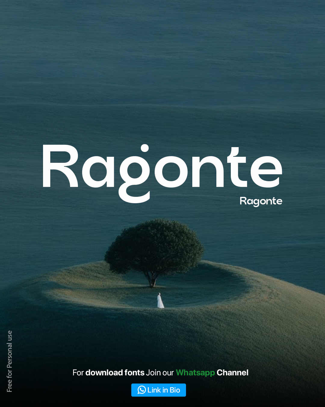
Ragonte is the kind of font that makes a quiet but confident statement. Its thick, evenly-weighted strokes and soft rounded terminals give it a plush, tactile feel — like the letters were sculpted rather than typed. The standout detail is the distinctive dotted "g," a small quirk that adds personality without tipping into gimmicky territory.
What makes Ragonte especially versatile for logo work is its balance of boldness and elegance. It's heavy enough to anchor a wordmark and demand attention, but its rounded curves keep it from feeling harsh or corporate. This makes it a strong pick for brands that want to feel premium and warm at the same time — think skincare lines, boutique fashion labels, or wellness studios that want to avoid the overly sterile look of typical minimalist branding.
Pairing tip: Combine Ragonte's bold headline weight with a lighter, more neutral sans-serif for body copy to let the logo breathe as the visual centerpiece.
2. Outflag
Style: Bold Grotesque Sans Best for: Tech startups, outdoor and travel brands, sports and fitness companies, SaaS products
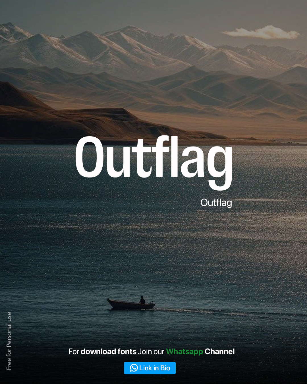
Outflag brings a sturdier, more structural energy to this list. Its letterforms are chunky and confident, with tight spacing and minimal ornamentation — the kind of font that says "we mean business" without shouting about it. The slightly condensed proportions make it excellent for fitting long brand names into compact logo spaces, which is a common real-world constraint designers run into.
There's a rugged, expedition-ready quality to Outflag that makes it a natural fit for outdoor gear brands, travel companies, and adventure-focused startups. But don't let that pigeonhole it — the same boldness translates beautifully to tech and SaaS branding, where a confident, no-nonsense wordmark helps a product feel trustworthy and established.
Pairing tip: Outflag works exceptionally well in all-caps for a logo lockup, paired with a thin horizontal rule or a small icon mark to balance its visual weight.
3. Gestavo
Style: Rounded Geometric Sans Best for: Children's brands, food and beverage, community platforms, friendly SaaS products
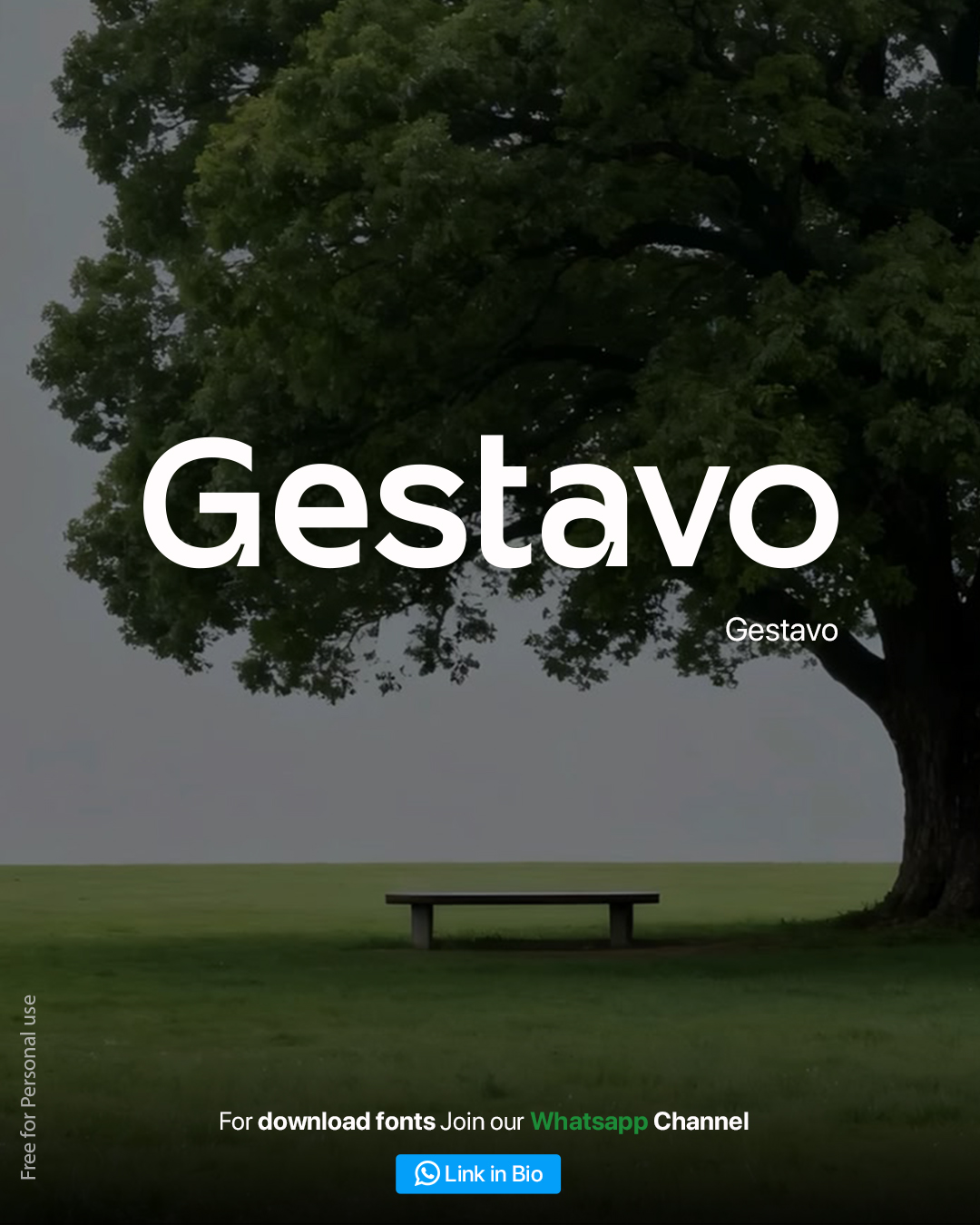
If Outflag is the confident athlete of this list, Gestavo is the warm, welcoming host. Every curve in this typeface feels soft and inviting, with rounded terminals and generous letter spacing that make it exceptionally easy to read at a glance — a crucial trait for any brand that wants to feel instantly approachable.
Gestavo shines in contexts where trust and friendliness are the priority. Food delivery apps, children's product lines, community-driven platforms, and family-oriented brands all benefit from a typeface this genuinely warm. It's also a smart choice for brands trying to soften a serious industry — think fintech apps trying to feel less intimidating, or healthcare brands trying to feel more human.
Pairing tip: Because Gestavo is already quite bold and rounded, pair it with a simpler, more neutral sans-serif for supporting text so the logo doesn't compete with itself.
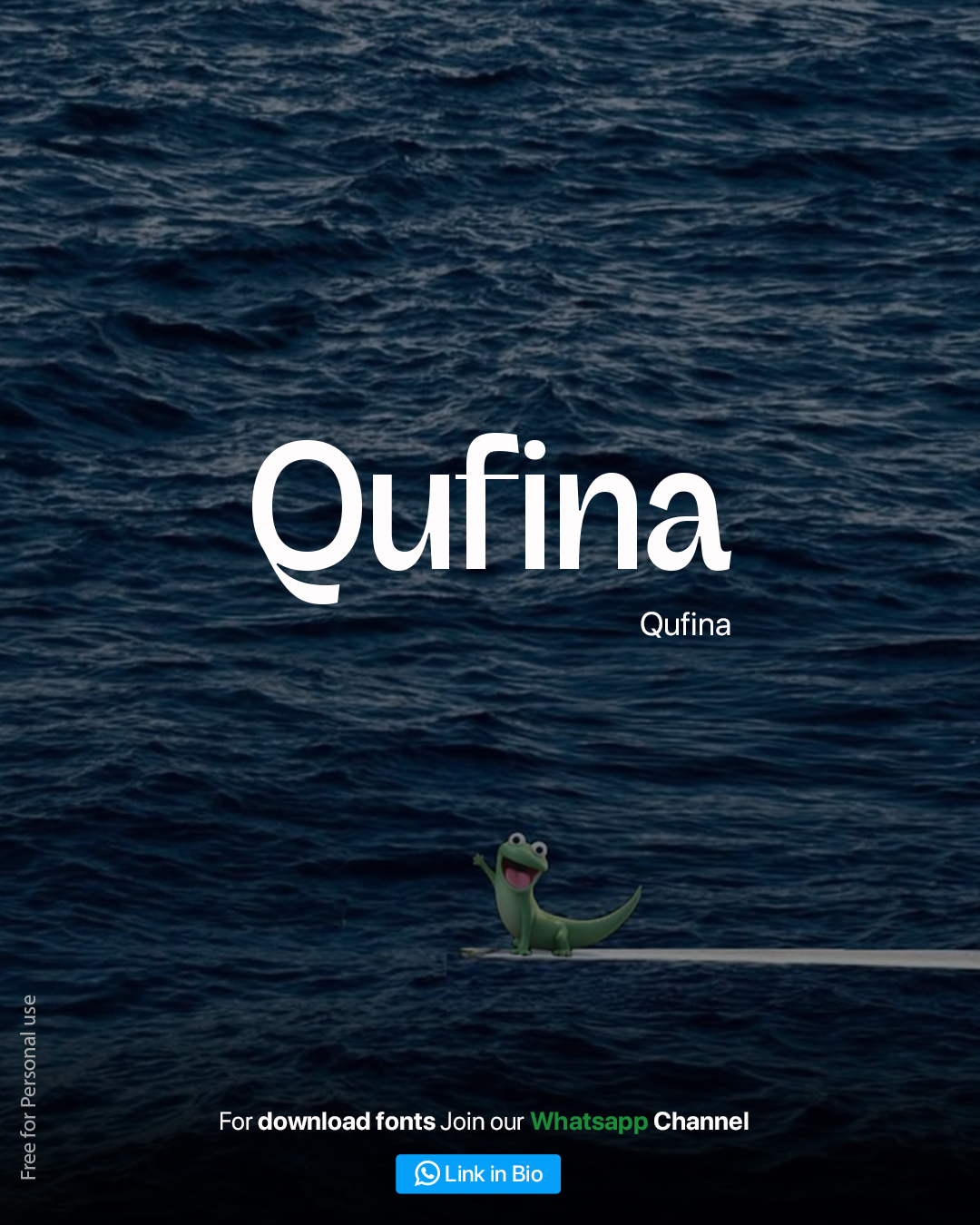
4. Qufina
Style: Modern Serif-Inspired Sans Best for: Editorial brands, boutique agencies, publishing platforms, premium lifestyle products
Qufina stands apart from the rest of this list with its subtle serif-like flourishes — most notably in the curled tail of the lowercase "a" and the elegant descender on the "Q." This gives it a literary, editorial quality that feels more considered and refined than a typical geometric sans.
This makes Qufina an excellent choice for brands that want to convey sophistication without going full traditional-serif. Boutique agencies, editorial platforms, book publishers, and premium lifestyle brands can all use Qufina to signal craft and attention to detail. It reads as intelligent and established, the kind of font you'd expect on the masthead of a design magazine rather than a mass-market consumer app.
Pairing tip: Let Qufina's serif-inspired details shine by keeping the surrounding design minimal — plenty of white space and a restrained color palette will let the typography do the heavy lifting.
5. Gorphy
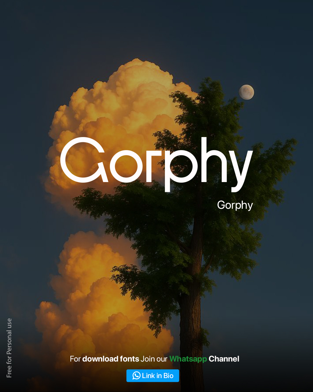
Style: Rounded Light Sans Best for: Wellness apps, creative studios, minimalist tech brands, personal portfolios
Gorphy takes the "rounded geometric" concept and strips it down to its most minimal, elegant form. With a lighter stroke weight and exceptionally open counters, it feels airy and calm rather than bold and attention-grabbing — a refreshing change of pace if the rest of this list feels too heavy for your project.
This makes Gorphy a great fit for brands built around calm, clarity, and simplicity. Meditation and wellness apps, minimalist tech products, architecture studios, and personal portfolio sites all benefit from a typeface this understated. It's proof that a logo font doesn't need to be loud to be memorable — sometimes restraint is the more sophisticated choice.
Pairing tip: Gorphy's light weight means it needs breathing room. Avoid cluttering your logo lockup with too many supporting elements, and let generous spacing do the work.
6. Rosefana
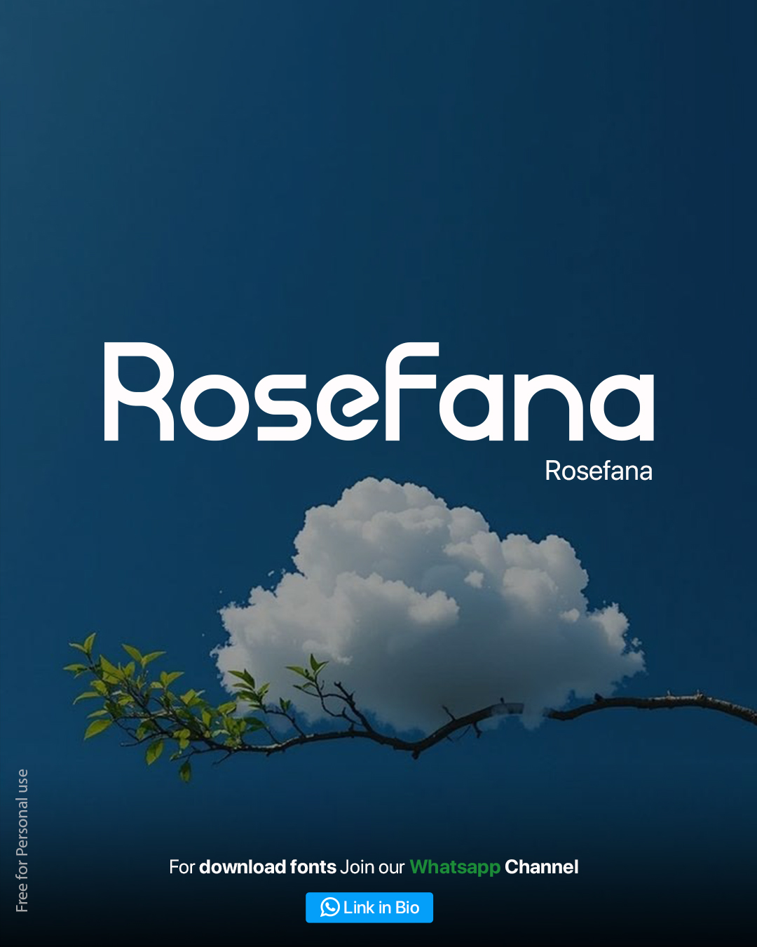
Style: Playful Rounded Sans Best for: Creative agencies, entertainment brands, youth-focused products, social apps
Rosefana closes out this list with the most overtly playful energy of the six. Its bouncy, rounded letterforms and tight, almost bubble-letter proportions give it an energetic, youthful character that immediately catches the eye. It doesn't try to be subtle — and that's exactly the point.
This makes Rosefana a natural fit for brands targeting a younger audience or leaning into a fun, expressive identity. Entertainment platforms, social apps, gaming brands, and creative agencies that want their branding to feel alive and current will find a lot to like here. It's a font that photographs well on social media thumbnails and stands out in a crowded feed — which, in 2026, might be one of the most important jobs a logo font can do.
Pairing tip: Rosefana's bold personality pairs surprisingly well with a plain, no-frills sans-serif for body text — the contrast keeps the logo feeling special rather than overwhelming.
How to Choose the Right Logo Font for Your Brand
With six strong options on the table, here's a quick framework to help you decide:
Want premium and warm? Go with Ragonte.
Want bold and rugged? Go with Outflag.
Want friendly and welcoming? Go with Gestavo.
Want editorial and refined? Go with Qufina.
Want calm and minimal? Go with Gorphy.
Want playful and energetic? Go with Rosefana.
A useful exercise: type your actual brand name into each of these six fonts and step back. Which one feels right before you even think about "why"? That gut reaction is usually a strong signal — typography works on an emotional level first, logical justification second.
It's also worth testing your chosen font at multiple sizes — full-screen hero banner, business card, and app icon — before locking it in. A font that looks stunning at 120px can sometimes lose clarity at 16px, so always stress-test your shortlist across real-world use cases.
A Note on Licensing
All six fonts featured in this roundup are labeled free for personal use. If you're planning to use any of them in a commercial project — a client logo, a product for sale, or any branding tied to revenue — always check the specific font's license terms before shipping, and purchase a commercial license where required. Supporting type designers keeps great free fonts like these coming.
Frequently Asked Questions
What makes a font good for logo design specifically, as opposed to body text? Logo fonts prioritize distinctiveness and legibility at extreme sizes over the reading comfort needed for long paragraphs. Bold weights, clear counters, and a memorable character (like a unique letterform or curve) matter more than optimizing for long-form readability.
Can I use more than one of these fonts in the same brand identity? Generally, it's best to pick one distinctive display font for your logo/wordmark and pair it with a simpler, neutral typeface for everything else — body copy, UI text, captions. Using two highly expressive display fonts together usually creates visual competition rather than harmony.
Are rounded fonts only suitable for casual or playful brands? Not at all. As this list shows, rounded geometric fonts span a huge emotional range — from the refined elegance of Qufina to the high-energy playfulness of Rosefana. The rounding softens a font's edges, but weight, spacing, and proportion determine whether the overall feel lands as premium, friendly, calm, or fun.
How do I know if a font pairs well with my existing brand colors? Mock up your logo font in your actual brand palette before finalizing anything. Bold, saturated colors tend to amplify a font's personality (great for Rosefana or Outflag), while muted, neutral palettes let more refined fonts like Qufina or Gorphy shine.
Ready to Download All 6 Fonts?
You've seen what each font can do — now it's time to put them to work in your own designs. All six fonts (Ragonte, Outflag, Gestavo, Qufina, Gorphy, and Rosefana) are available as a free bundle for personal use.
Tagged
Nitin Monga
Graphic Designer, 3D Artist & Full-Stack Developer based in Punjab, India. Designing and building digital products since 2013.