How to Review UI Design: 7-Point UI Checklist
Review any website, app or dashboard with this practical 7-point UI design checklist covering colour, spacing, alignment, hierarchy and typography.
Nitin Monga
Designer · Developer · 3D Artist
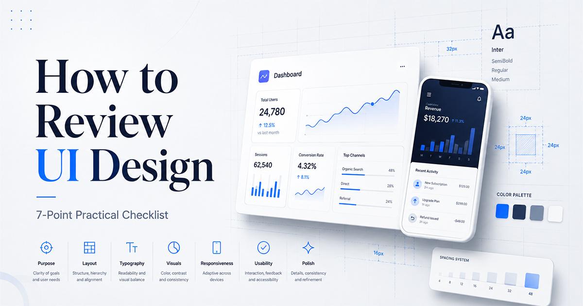
How to Review a UI Design: A Practical 7-Point Checklist Before You Ship
Design feedback often sounds like this:
“Something feels off.”
“Make it cleaner.”
“It needs to look more professional.”
Although such comments express a genuine reaction, they rarely tell a designer what actually needs to change.
Is the layout poorly aligned? Is the typography too weak? Are the colours competing with one another? Is the page crowded, or is the information hierarchy unclear?
A structured UI design review replaces subjective opinions with specific observations. Instead of deciding whether a design simply looks good or bad, you evaluate the elements that determine how polished, readable and usable it feels.
This guide presents a practical seven-point UI design checklist that you can use to review website pages, mobile app screens, dashboards, landing pages and digital posters.
What Is a UI Design Review?
A UI design review is the process of evaluating the visual structure and presentation of a digital interface before it is approved, developed or published.
A useful review does not focus only on decoration. It examines whether the interface:
Communicates information clearly
Guides attention to the right elements
Uses spacing and alignment consistently
Maintains readable typography
Provides sufficient colour contrast
Follows a repeatable visual system
Feels intentional rather than accidental
A UI review can be performed manually by a designer, collaboratively by a team or with the support of an automated design analysis tool.
The purpose is not to remove creativity. It is to identify preventable problems before they reach users or clients.
Start by Identifying the Design Context
Before evaluating a screenshot, identify what type of design you are reviewing.
A landing page should not be judged in exactly the same way as a mobile app screen. A dashboard may contain more information than a promotional poster, while a poster may rely more heavily on colour and visual hierarchy.
Ask these questions first:
Is this a website, mobile interface, dashboard or poster?
What is the primary action users should take?
What information should users notice first?
Who is the intended audience?
Is the design being reviewed as a full page or as an individual component?
Once the context is clear, review the design across the following seven areas.
1. Colour Usage and Contrast
Colour should help users understand the interface. It should not be added only to make the design look more exciting.
Start by identifying the roles assigned to different colours.
A well-planned interface commonly includes:
A primary brand colour
One or two supporting colours
Neutral background and surface colours
Text colours
Status colours for success, warning and error messages
Problems appear when too many colours compete for attention or when visually similar colours are used without a clear purpose.
Questions to ask
Is the primary colour used for the most important actions?
Are too many bright colours competing on the same screen?
Is body text clearly readable against its background?
Are buttons visually distinct from decorative elements?
Do error and success states rely on more than colour alone?
Does the palette feel consistent with the brand?
For accessibility, WCAG 2.2 specifies a minimum contrast ratio of 4.5:1 for normal text and 3:1 for qualifying large text. These should be treated as minimum thresholds rather than visual preferences.
Low-contrast text may appear elegant in a design file but become difficult to read on smaller screens, low-quality displays or in bright environments.
Quick colour test
Convert the design to greyscale temporarily.
If the main heading, supporting content and primary action all appear to have similar visual weight, the design may be relying too heavily on colour instead of building a strong hierarchy.
2. Spacing
Spacing is one of the fastest ways to distinguish a polished interface from an unfinished one.
Good spacing creates relationships. Elements positioned close together appear connected, while larger gaps communicate separation between different groups.
Spacing problems usually occur when values are chosen individually instead of following a system.
For example, one card may use 20 pixels of padding, another 27 pixels and a third 32 pixels without a clear reason. Each difference may appear small, but together they make the interface feel inconsistent.
Questions to ask
Is the space between related elements smaller than the space between separate sections?
Do cards and containers use consistent internal padding?
Are headings positioned close enough to the content they introduce?
Is text crowded against icons, borders or buttons?
Does the page contain enough breathing room?
Is the mobile version more compressed than necessary?
You do not have to use an eight-pixel system in every project. What matters most is that spacing values feel intentional and repeatable.
A simple spacing scale might include:
4px for very small gaps
8px for closely related elements
16px for standard component spacing
24px for grouped content
32px or more for larger sections
The exact numbers can change, but the relationships should remain consistent.
3. Alignment
Users may not consciously identify a five-pixel alignment error, but they often sense that something is wrong.
Alignment creates visual order. When headings, paragraphs, buttons, cards and images share common edges, the interface becomes easier to scan.
Questions to ask
Do section headings begin on the same vertical line?
Are cards aligned consistently within their grid?
Do icons and labels share a common centre or baseline?
Are button labels properly centred?
Are form fields and labels aligned?
Do left and right margins remain consistent?
Are elements aligned to a deliberate grid?
Turn on layout guides in your design software and follow the major visual lines through the page.
Misalignment commonly appears in:
Cards with different internal padding
Buttons containing icons
Form labels and inputs
Pricing tables
Navigation bars
Mixed text and image sections
Components copied from different design files
Correcting alignment often improves a design without changing its colours, typography or content.
4. Visual Consistency
Consistency reduces the number of visual rules users need to understand.
If every button, card, form field and heading follows a different style, users must repeatedly interpret the interface. A consistent system makes interactions more predictable.
Questions to ask
Do similar buttons use the same height and radius?
Are heading sizes reused consistently?
Do all cards use the same shadow treatment?
Are icons drawn in the same style?
Do form fields have consistent borders and focus states?
Are similar sections structured in similar ways?
Are the same spacing values repeated throughout the interface?
Consistency does not mean every section must look identical. It means differences should communicate purpose.
A primary button can look different from a secondary button because it has a different role. Two primary buttons performing equally important actions should not look unrelated.
Create a small interface inventory during your review. Record the different button styles, font sizes, border radii, shadows, icon styles and spacing values being used.
Unexpected duplicates often reveal where the design system has started to break down.
5. Visual Hierarchy
Visual hierarchy determines the order in which people notice and process information.
Every screen should answer three questions:
What should users notice first?
What should they understand next?
What should they do after that?
Hierarchy is created through several properties:
Size
Weight
Colour
Contrast
Position
Whitespace
Scale
Repetition
A larger element is not automatically the most important. A small, high-contrast button may attract more attention than a large grey heading.
Questions to ask
Is there one obvious focal point?
Can users identify the page purpose quickly?
Is the primary action more visible than secondary actions?
Are headings clearly differentiated from body text?
Is supporting information visually quieter?
Are too many elements competing for attention?
Does the eye move through the design in a logical sequence?
A useful test is to zoom out until individual words become difficult to read.
At that distance, you should still be able to identify the main heading, major sections, images and primary call to action. If everything blends into one visual block, the hierarchy needs improvement.
6. Typography
Typography affects both the personality and usability of an interface.
A design may use an attractive font and still have weak typography because of poor sizing, line height, line length, weight or spacing.
Questions to ask
Is the body text large enough to read comfortably?
Is there a clear difference between headings and paragraphs?
Are too many font sizes or weights being used?
Is the line height appropriate for the font?
Are paragraphs too wide?
Are labels and captions still readable?
Is text alignment consistent?
Do font choices support the intended brand personality?
A limited type scale generally creates a stronger system than a collection of unrelated sizes.
For example:
Display heading
Page heading
Section heading
Body text
Small supporting text
For body copy, a line height around 1.5 can be a useful starting point, although the ideal value depends on the typeface, font size and available width. W3C accessibility guidance also recognises increased line spacing as helpful for readers who have difficulty tracking dense text.
Typography should be reviewed on the actual target screen. Text that feels balanced on a large desktop artboard may become cramped or oversized on a mobile device.
7. Corner Rounding and Shape Language
Border radius is a small detail with a surprisingly large effect on consistency.
Interfaces often become visually fragmented when they mix:
Sharp rectangular cards
Slightly rounded input fields
Highly rounded buttons
Pill-shaped badges
Circular image containers
Each shape may work independently, but together they may not feel like part of the same design system.
Questions to ask
Do similar components use the same radius?
Does the radius fit the personality of the brand?
Are pill shapes reserved for appropriate controls and labels?
Are nested elements using compatible corner values?
Are images following the same shape language as cards?
Is rounding being applied intentionally?
You do not need to use one radius everywhere. Instead, create a small scale.
For example:
4px for compact interface elements
8px for form fields and buttons
12px or 16px for larger cards
Full rounding only for pills, avatars and circular controls
The design should feel as though its shapes belong to the same visual family.
A 10-Minute UI Design Review Process
When time is limited, use this sequence.
Minute 1: Identify the objective
Determine the intended audience, primary message and main action.
Minute 2: Zoom out
Check whether the page has an obvious focal point and readable section structure.
Minute 3: Review in greyscale
Evaluate whether hierarchy still works without colour.
Minutes 4–5: Check spacing and alignment
Look for inconsistent margins, padding, gaps and grid positions.
Minute 6: Inspect typography
Compare font sizes, weights, line height and paragraph width.
Minute 7: Test colour contrast
Check important text, buttons and status elements against accessibility requirements.
Minute 8: Review repeated components
Compare cards, buttons, fields, badges and icons for visual consistency.
Minute 9: Check shape language
Review border radii, shadows, borders and image treatments.
Minute 10: Write actionable feedback
Replace general comments with specific recommendations.
Instead of:
The cards look untidy.
Write:
The three cards use different internal padding and heading positions. Apply the same horizontal padding and align all headings to a shared top baseline.
Specific feedback is easier to understand, implement and verify.
How to Analyse a UI Screenshot Automatically
A structured checklist is valuable, but manually reviewing every detail takes time. An automated UI design analyser can provide a useful first review before the design is presented to a client or team.
The Free UI Design Analyzer allows you to upload a JPG, PNG or WebP screenshot and receive a scored report covering:
Colour usage
Spacing
Alignment
Consistency
Visual hierarchy
Typography
Corner rounding
It also provides separate analysis modes for web interfaces, mobile interfaces, posters and dashboards because different design formats require different priorities.
To use it:
Capture a clear screenshot of the complete design or component.
Select the most relevant analysis mode.
Upload the screenshot.
Review the overall score and individual criteria.
Correct the most important issues.
Upload the revised version and compare the result.
[Analyse your UI screenshot with the Free UI Design Analyzer.]
Automated feedback should be treated as a second opinion rather than final approval. A tool can identify measurable visual problems, but it cannot fully understand brand personality, business objectives, cultural context or emotional impact.
The strongest process combines structured automated feedback with human design judgement.
How to Give Better UI Design Feedback
Good feedback should describe:
The issue
Its effect
The recommended improvement
For example:
The secondary button currently uses the same colour and visual weight as the primary action, so users may not know which action is more important. Use a lower-emphasis outline or text treatment for the secondary button.
Avoid feedback based entirely on personal preference, such as:
I do not like this colour.
Make it pop.
It needs more creativity.
Make the logo bigger.
This section feels empty.
Instead, connect the recommendation to hierarchy, readability, accessibility, consistency or user intent.
Final UI Design Checklist
Before approving a design, confirm that:
Colours have clearly defined roles
Text has sufficient contrast
Spacing follows a repeatable system
Related elements are grouped together
Major elements share common alignment lines
Repeated components look consistent
The primary message is visually dominant
The main action is easy to identify
Typography is readable at the target screen size
Font sizes and weights follow a clear scale
Border radii and shapes feel consistent
The interface works in its intended context
Feedback has been written as actionable corrections
Final Thoughts
A professional UI design is rarely created through one dramatic improvement. It is usually the result of many small, intentional decisions.
Colour, spacing, alignment, consistency, hierarchy, typography and shape language work together. A weakness in one area can make the entire design feel less polished.
Using a repeatable review framework makes feedback clearer and design decisions easier to defend. It also helps designers identify problems before clients or users encounter them.
Whether you review designs manually or use an automated UI analysis tool as a second opinion, the objective remains the same: replace “something feels wrong” with feedback that explains exactly what can be improved.
Frequently Asked Questions
What is a UI design checklist?
A UI design checklist is a structured list of visual and usability elements that should be reviewed before an interface is approved or published. It commonly covers colour, contrast, spacing, alignment, consistency, hierarchy and typography.
How can I analyse a UI design screenshot?
You can manually evaluate the screenshot against established design principles or upload it to a UI design analyser that scores individual visual criteria and identifies possible improvements.
What makes a UI design look professional?
Professional interfaces generally use clear hierarchy, consistent spacing, deliberate alignment, readable typography, accessible contrast and a limited set of reusable component styles.
Can an automated UI analyser replace a designer?
No. Automated analysis is useful for identifying measurable issues and inconsistencies, but human judgement is still required to assess brand personality, emotional impact, originality, audience expectations and business objectives.
What types of designs can be reviewed?
The same review framework can be applied to websites, landing pages, mobile app screens, dashboards, web applications, digital posters and individual interface components.
Tagged
Nitin Monga
Graphic Designer, 3D Artist & Full-Stack Developer based in Punjab, India. Designing and building digital products since 2013.