// Design Tools
Free UI Design
Analyzer
Free website UI analyzer for instant UI analysis. Upload any screenshot and get a scored design analyzer report across 8 criteria: color, spacing, alignment, consistency, hierarchy, typography, corner rounding and icon consistency. No login.
Featured On
Good design gets better with the right feedback.
Drop your design here to get started · JPG, PNG, WebP · max 10MB
By analyzing a design, you agree that the uploaded image and resulting analysis may be stored and used to improve UI Analyzer. Some scans may also appear in Recent Scans or remain accessible through shareable result links. Do not upload confidential, private or sensitive designs that you do not want stored or potentially displayed publicly. Privacy Policy
// Overview
What is the UI Design Analyzer?
The UI Design Analyzer is a free browser-based tool that performs a full UI analysis on website, mobile app, dashboard, poster, social and packaging designs. It works as a UI checker and visual design checker in one, scoring eight visual-design areas: colour, spacing, alignment, consistency, hierarchy, typography, corner rounding and icon consistency, then giving you a single UI score out of 100. No registration is required.
- Price
- Free, with daily limits; optional paid PDF
- Signup required
- No
- Supported formats
- JPG, PNG and WebP
- Maximum file size
- 10MB
- Analysis modes
- Web UI, mobile, poster, dashboard, social and packaging
- Results
- Overall score, category scores and improvement recommendations
// How It Works
What the design analyzer checks
Each analysis considers 8 design criteria. The displayed weights are Web UI values when icons are scored; weights vary by mode.
Color Usage
13.65% weightAI review of apparent palette harmony and visual contrast; not a measured WCAG compliance audit.
Spacing
16.38% weightChecks padding, margin consistency, and breathing room between elements. Tight spacing is one of the most common UI mistakes.
Alignment
16.38% weightDetects misaligned elements, off-grid layouts, and inconsistent edge margins that break visual order.
Consistency
13.65% weightMeasures whether corner radii, font sizes, and spacing values follow a consistent system throughout.
Hierarchy
12.74% weightAssesses whether the design clearly guides the eye. Primary, secondary, and tertiary information should each have distinct visual weight.
Typography
10.92% weightLooks at font-size variety, line-height, and whether text scales are logical (e.g., a proper heading/body ratio).
Corner Rounding
7.28% weightChecks that border-radius values are consistent and appropriate for the design style. Mixing sharp and pill shapes reads as unpolished.
Icon Consistency
9% weightChecks whether icons share one visual family, stroke weight, size, and color. Skipped entirely — never penalized — when a design has no icons.
// Transparency
How the UI Analyzer calculates scores
An honest breakdown of what the tool measures and what it can't judge.
What signals are evaluated
Concrete visual signals read from the screenshot itself: text-to-background contrast, spacing and padding consistency, grid alignment, border-radius consistency across components, typography scale, and which element draws the eye first.
How the eight categories are weighted
Color, spacing, alignment, consistency, hierarchy, typography, corner rounding, and icon consistency are each scored 0–100, then combined into one weighted total. For Web UI with icons, spacing and alignment each weigh 16.38%; icons weigh 9%. Without icons or an available icon score, the seven base criteria keep their full weights.
Why modes use different weights
Different formats succeed on different signals. A dashboard is judged on whether its grid holds up under real data, so alignment and consistency are weighted heavily. A poster or social graphic is judged on whether it grabs attention in seconds, so color and hierarchy are weighted heavily instead.
What the tool aims to identify
Likely visual problems: low apparent contrast, inconsistent spacing or corner radii, misalignment and unclear hierarchy. AI estimates can be wrong; review the reported issues in context.
What it cannot judge
Brand personality, emotional tone, copywriting quality, and real usability with actual users. It only sees a static screenshot, so it can't test interactive behaviour, animations, or accessibility beyond visual contrast.
// Examples
See the analyzer in action
Three illustrative walkthroughs of review questions across different formats. Screenshots and scores are placeholders, not verified before/after experiments. Real comparisons will include screenshots, findings, changes and a result link.
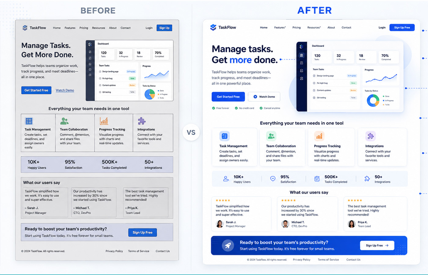
Example 1: Website landing page analysis
Picture a landing page with a strong headline and clean typography but three structural problems. An alignment check would flag inconsistent left-edge margins if the feature cards sat roughly 12px off-grid from the navigation. A spacing check would question a primary CTA button with only 8px of internal padding. And a hierarchy check would note a secondary “Learn more” link carrying nearly the same visual weight as the primary “Get Started” button, which blurs which action matters most.
The hypothetical scores illustrate how a report might present an initial review and a later iteration. They are not recorded scan results or evidence of an improvement measured by this tool.
Feature cards: ~12px off the nav's left edge → align to the same grid
Primary CTA button: 8px padding, cramped → increase to 16px
Secondary link: same visual weight as CTA → reduce size so the CTA stands out
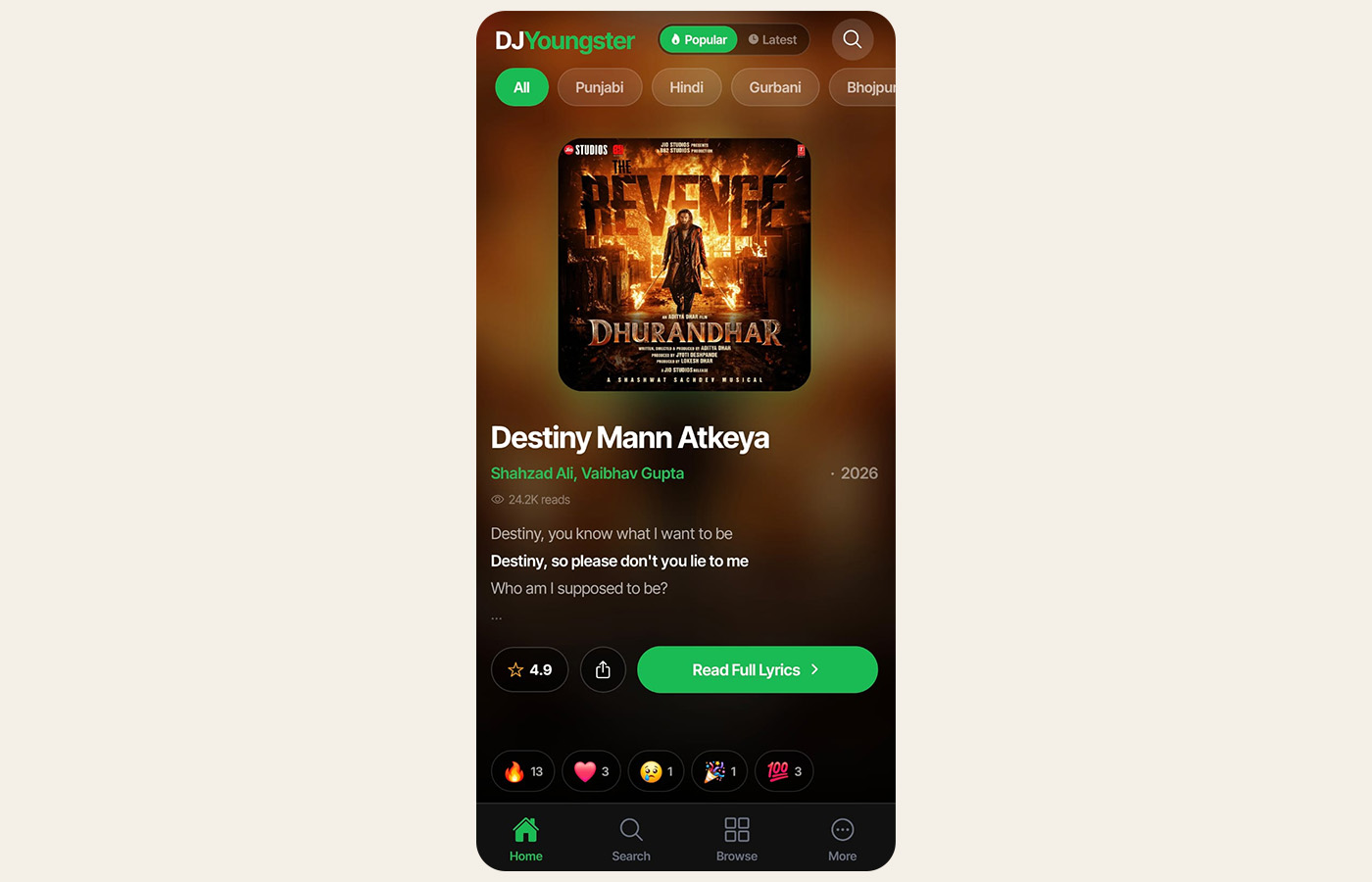
Example 2: Mobile app screen analysis
Mobile screens fail for different reasons than desktop layouts, so Mobile mode uses mobile-focused review context and gives spacing and alignment more weight (20% each before the icon adjustment, versus 18% for Web UI).
This illustration highlights spacing between controls, readable text and the prominence of the primary action. The AI may comment on their appearance, but a screenshot alone cannot verify actual touch-target dimensions, font sizes or interaction behavior.
The displayed 82/100 is an illustrative placeholder, not a measured mobile result.
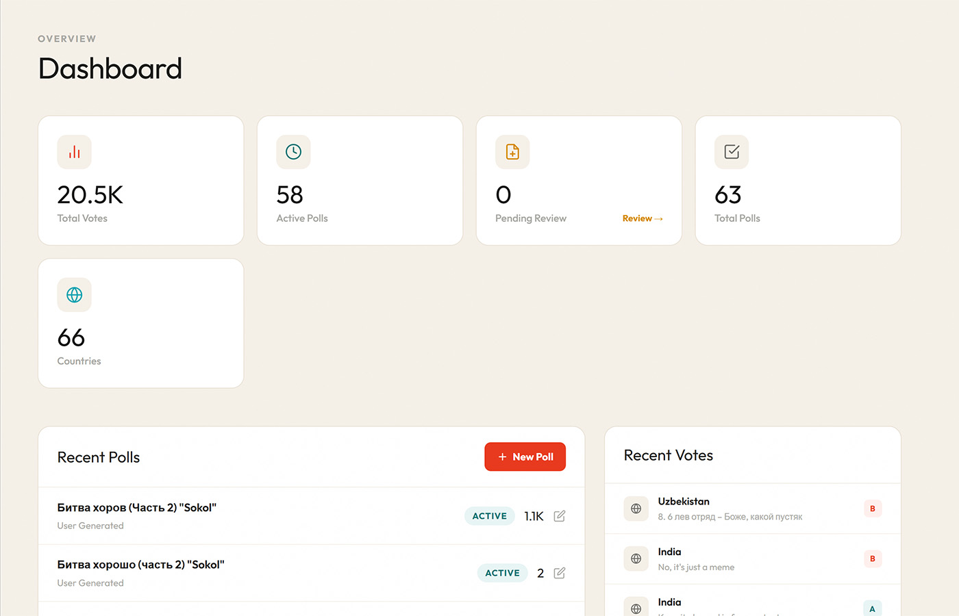
Example 3: Dashboard analysis
Dashboards live or die on density, meaning how much information fits on screen without the layout collapsing into noise. When Dashboard mode is selected, the analyzer shifts its weighting toward alignment and consistency, since a dashboard's credibility depends on whether every widget, chart, and metric card sits on the same underlying grid.
This illustration highlights repeated metric cards, chart alignment, spacing and consistent status colors. These are visual review questions, not findings from a verified scan.
The displayed 85/100 is an illustrative placeholder, not a measured dashboard result.
// More Tools
Other tools you may like
Brand QR Studio
Generate styled QR codes for URLs, WiFi, UPI, WhatsApp, and more. PNG & SVG export.
Logo Scale Tester
Preview your logo at 10 real-world sizes, from favicon 16px to billboard. No upload needed.
ATS Resume Builder
Build an ATS-friendly resume with a live score. Free PDF & DOCX export. No signup required.
Color Palette Generator
Generate harmonious palettes or extract colors from any image. Export as CSS, Tailwind, or SCSS.
Indian Language Typing Tool
Type phonetically in English and get Hindi, Punjabi, Tamil, Telugu, Bengali and 6 more Indian scripts instantly.
Free Quote Creator Online
Free quote maker online. Make quote images for Instagram with custom fonts and colors. No watermark, no signup.
Font Pairing Preview
Preview 20 handcrafted Google Font pairings on a real website layout. Find your heading + body combo and copy the CSS.
YouTube Keyword Tool
Explore real YouTube autocomplete suggestions from one seed keyword. Filter by short/long-tail and intent, copy as tags or CSV.
Marriage Biodata Maker
Make a marriage biodata in English, Hindi or Punjabi with six designs and your photo. Free print-ready PDF, no watermark.
// FAQ
Frequently asked questions
What happens to my uploaded screenshot?
Screenshots are uploaded to our server, resized/compressed into JPEGs, stored on Cloudinary and sent to a third-party AI provider for analysis. Image URLs, mode, scores, feedback, recommendations, palette, timestamps and hashed IP addresses are stored in the database. Uploaded designs and analysis results are retained indefinitely to provide shareable results, maintain scan history and improve the accuracy and consistency of UI Analyzer. We may use submitted designs, scores and analysis results to evaluate patterns, test changes and improve the tool internally. Eligible scans may appear in Recent Scans/public areas and shareable result links may remain accessible. This internal evaluation is separate from third-party AI processing; it is not a claim that we or a provider train AI on submissions. There is no automatic expiry. For privacy or deletion requests, use the contact page and include your result link; removal of a database report alone does not remove its Cloudinary image.
Is the UI Design Analyzer completely free?
Browser analysis and shareable results are free with no account required. Daily usage limits apply, and an available rewarded ad can unlock an additional scan. The downloadable PDF report is a separate paid option.
What file formats are supported?
JPG, PNG, and WebP files up to 10MB. For best results use a full-page or component screenshot at 1x or 2x resolution, and avoid heavily compressed thumbnails.
How is the overall score calculated?
Eight criteria are scored independently: color, spacing, alignment, consistency, hierarchy, typography, corner rounding, and icon consistency. They're then blended using mode-specific weights, so a dashboard layout puts more weight on alignment and consistency than a poster design would.
What is a good UI design score?
90–100 is S-grade (publication ready). 80–89 is A-grade (professional quality). 70–79 is B-grade (good with minor fixes). Below 60 means there are foundational issues worth addressing before shipping.
What is the difference between the six analysis modes?
Web UI, Mobile, Poster, Dashboard, Social and Packaging select different scoring weights and visual context for the AI prompts. Spacing/alignment matter more for interfaces; hierarchy/color matter more for posters and social graphics. These are advisory priorities, not a physical touch-target or usability test.
Can I analyze a mobile app screenshot?
Yes. Mobile mode uses mobile-focused visual context and emphasizes spacing and alignment. A screenshot cannot verify actual touch-target dimensions or interaction behavior.
How accurate is the analysis compared to a human designer?
The analyzer evaluates common visual-design signals such as contrast, spacing, alignment, hierarchy and consistency. It is intended as a structured second opinion, not a replacement for professional user research or human design judgement.
Does this work as a UX analyzer too, not just for UI?
Partly. Hierarchy, spacing and alignment are visual signals that affect usability, so a low score there often points to a UX problem too. But the analyzer only sees a static screenshot: it cannot test user flows, navigation, interactions, accessibility with assistive technology or how real people complete tasks. Use it as a visual first pass alongside usability testing, not as a UX audit.
What is UI analysis, and how does this tool do it?
UI analysis means reviewing a screen for visual-design problems, color, spacing, alignment, hierarchy, typography, before real users see it. This tool automates that review: upload a screenshot and it runs the same eight checks a designer would, then returns a score and specific fixes instead of a vague opinion.
Can I use this as a free UI checker or design checker?
Yes. UI analyzer, UI checker, and design checker all describe the same job here, checking a screenshot against consistent visual-design rules. There's no separate mode to switch on; every upload runs the full check for free.
Can I check my website's UI score for free?
Yes. Upload a screenshot of your site (desktop or mobile) in Web UI mode and you'll get a UI score out of 100, plus the category breakdown behind it, at no cost and with no login. It's a fast way to rate your website's UI before asking for outside feedback.
Is there a checklist I can follow alongside this tool?
Yes. See the scoring methodology for the eight criteria and mode weights. You can use those criteria for a separate manual review alongside the automated analysis.
// Built by
Nitin MongaDesigner and digital product builder creating web experiences and tools since 2013.
I've spent years moving between design tools and code editors, building brands, interfaces and full products from the ground up as a graphic designer and full-stack developer. Somewhere along the way I got tired of waiting on a second opinion just to catch the small stuff: a misaligned button, cramped spacing, a headline that doesn't stand out. So I built the UI Design Analyzer, the fast, structured first pass I wished I had on every early design review.
AI-assisted analysis; uploads retained · Version 2.1 · Last updated:
How it works, data handling & limitations
- How it works
- The server prepares a screenshot for an AI vision pass, then a text-only scoring pass. Eight design criteria feed a mode-weighted score; icon consistency is skipped when absent or unavailable.
- Data & privacy
- Screenshots are uploaded to our server, resized/compressed into JPEGs, stored on Cloudinary and sent to a third-party AI provider for analysis. Image URLs, mode, scores, feedback, recommendations, palette, timestamps and hashed IP addresses are stored in the database. Uploaded designs and analysis results are retained indefinitely to provide shareable results, maintain scan history and improve the accuracy and consistency of UI Analyzer. We may use submitted designs, scores and analysis results to evaluate patterns, test changes and improve the tool internally. Eligible scans may appear in Recent Scans/public areas and shareable result links may remain accessible. This internal evaluation is separate from third-party AI processing; it is not a claim that we or a provider train AI on submissions. There is no automatic expiry. For privacy or deletion requests, use the contact page and include your result link; removal of a database report alone does not remove its Cloudinary image.
- How we evaluate/test it
- The scoring weights and image/AI pipeline have been reviewed against the source implementation. No published accuracy benchmark or documented programme of manual design-review comparisons was found. Internal evaluation may use retained scans; this does not establish a measured accuracy rate.
- Limitations
- Advisory visual feedback, not a usability study or accessibility certification. Image quality, selected mode, omitted context and model changes can affect results. Historical percentiles compare stored scans, not an independent quality benchmark.
Use the contact form to report a bug, an incorrect result or a privacy concern. Include the tool name and result link when available.
Changelog
- Described AI processing as a third-party AI provider consistently across the page, FAQ and Privacy Policy.
- Listed all eight criteria and all six analysis modes consistently.
- Answered the UX question honestly: visual signals only, not a UX audit.
- Rewrote illustrative examples so they no longer read as recorded scans.
- Merged the creator and changelog sections into one trust section with full history.
- Clarified indefinite retention, public visibility and internal evaluation.
- Documented eight criteria and actual mode weights.
- Added standardized trust information and labeled illustrative scores.